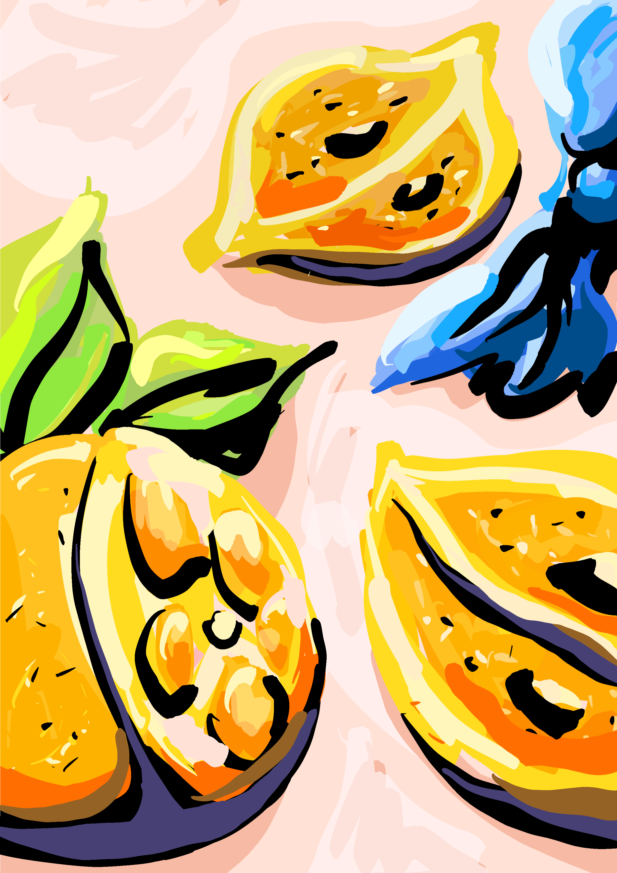
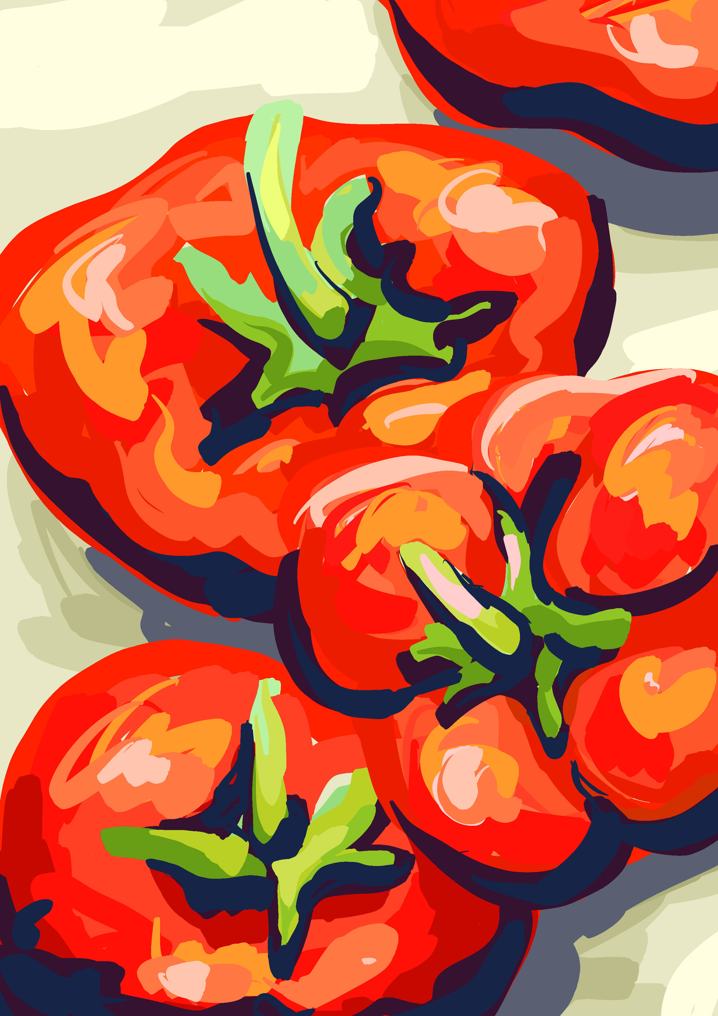
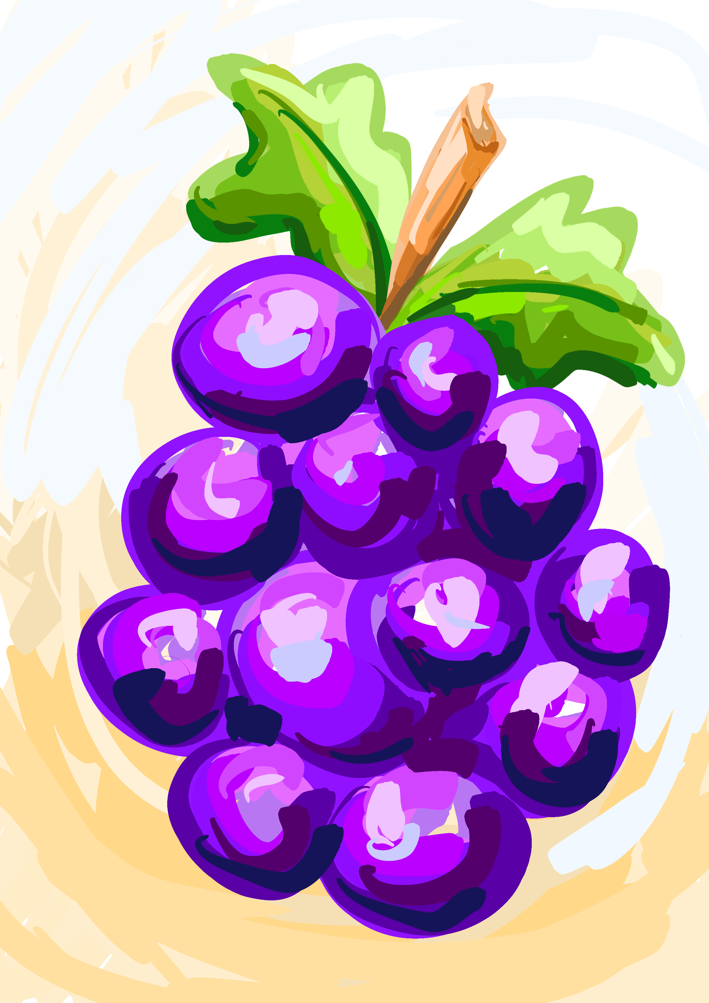
These vibrant and eye-catching digital art posters feature a colorful array of fresh fruits and vegetables. Each piece bursts with flavour and energy, capturing the essence of farm-fresh produce in stunning detail. The artwork is inviting and lively, with every fruit and veggie looking crisp, juicy, and irresistibly delicious. Perfect for promoting healthy living, these illustrations make eating fresh feel fun, nourishing, and downright mouthwatering.
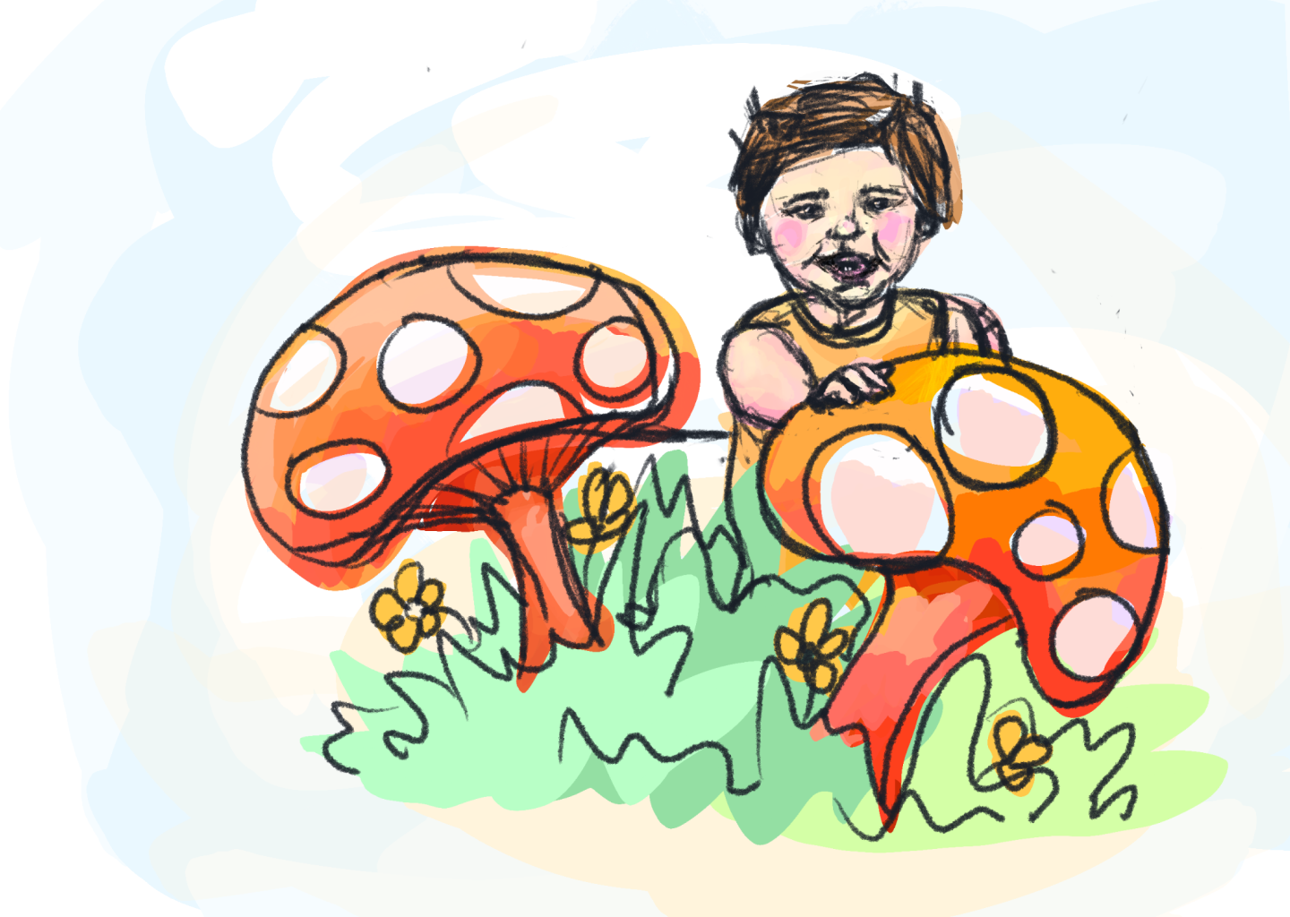
Kids book illustration
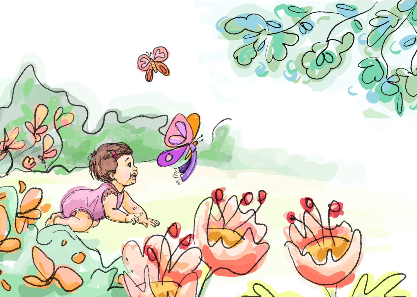
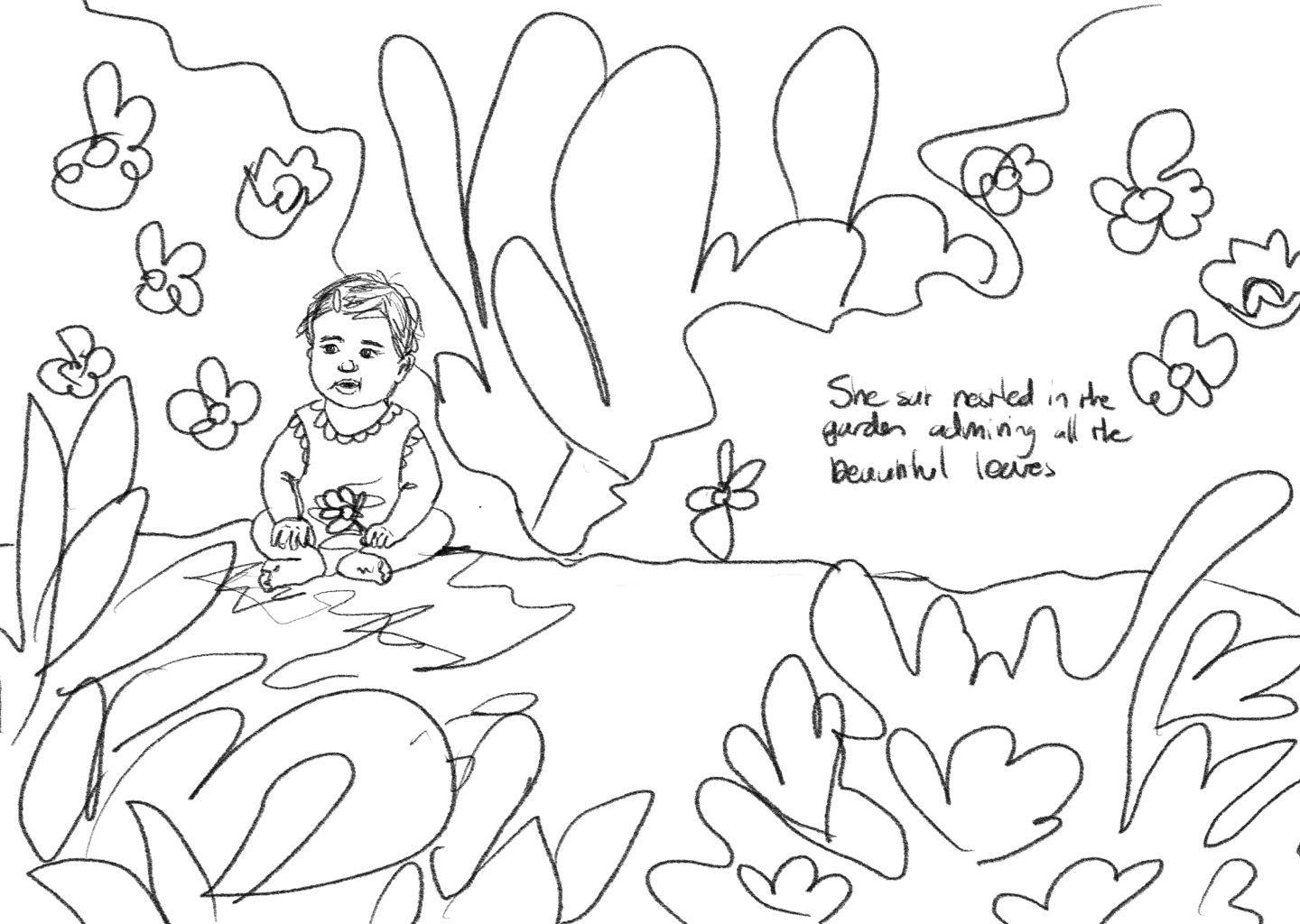
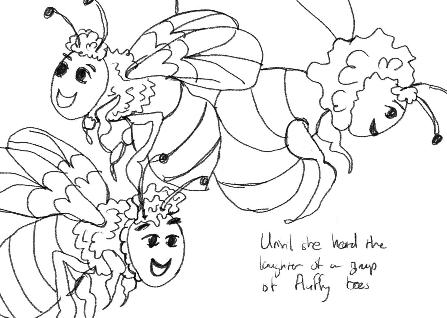
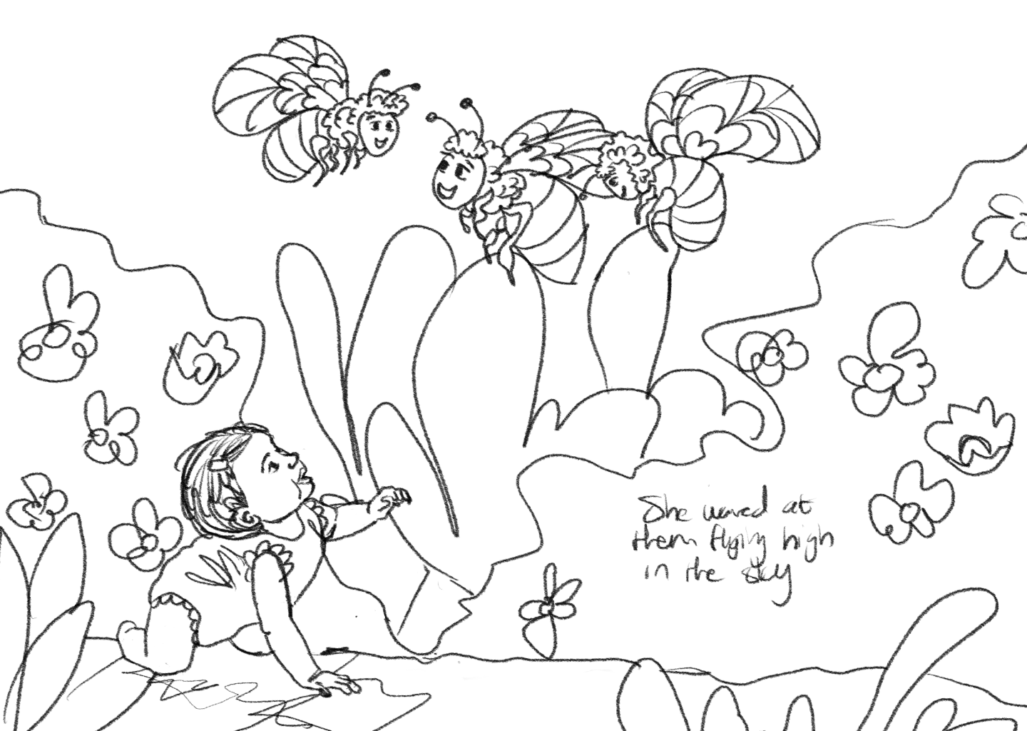
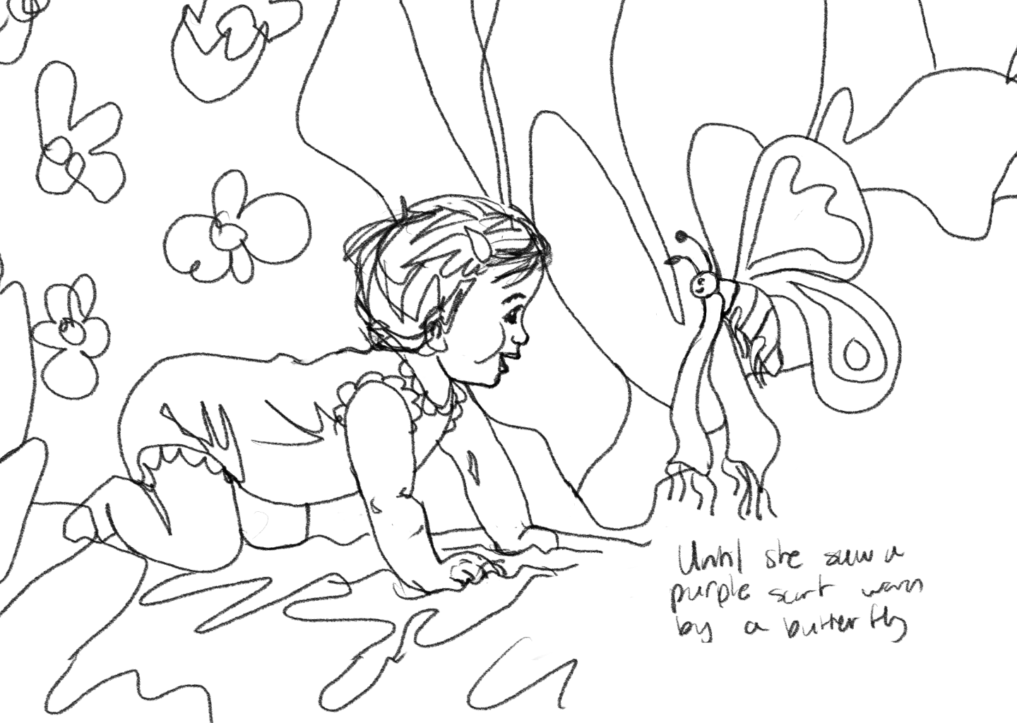
This is a children’s storybook I’m currently working on — still very much a work in progress! The imagery hints at the visual style I’m developing, along with a few pages shown in wireframe mode. One of the most exciting parts has been bringing all the different characters to life! I’ve illustrated everything from scratch on my iPad, and I can’t wait to see the full book come together.
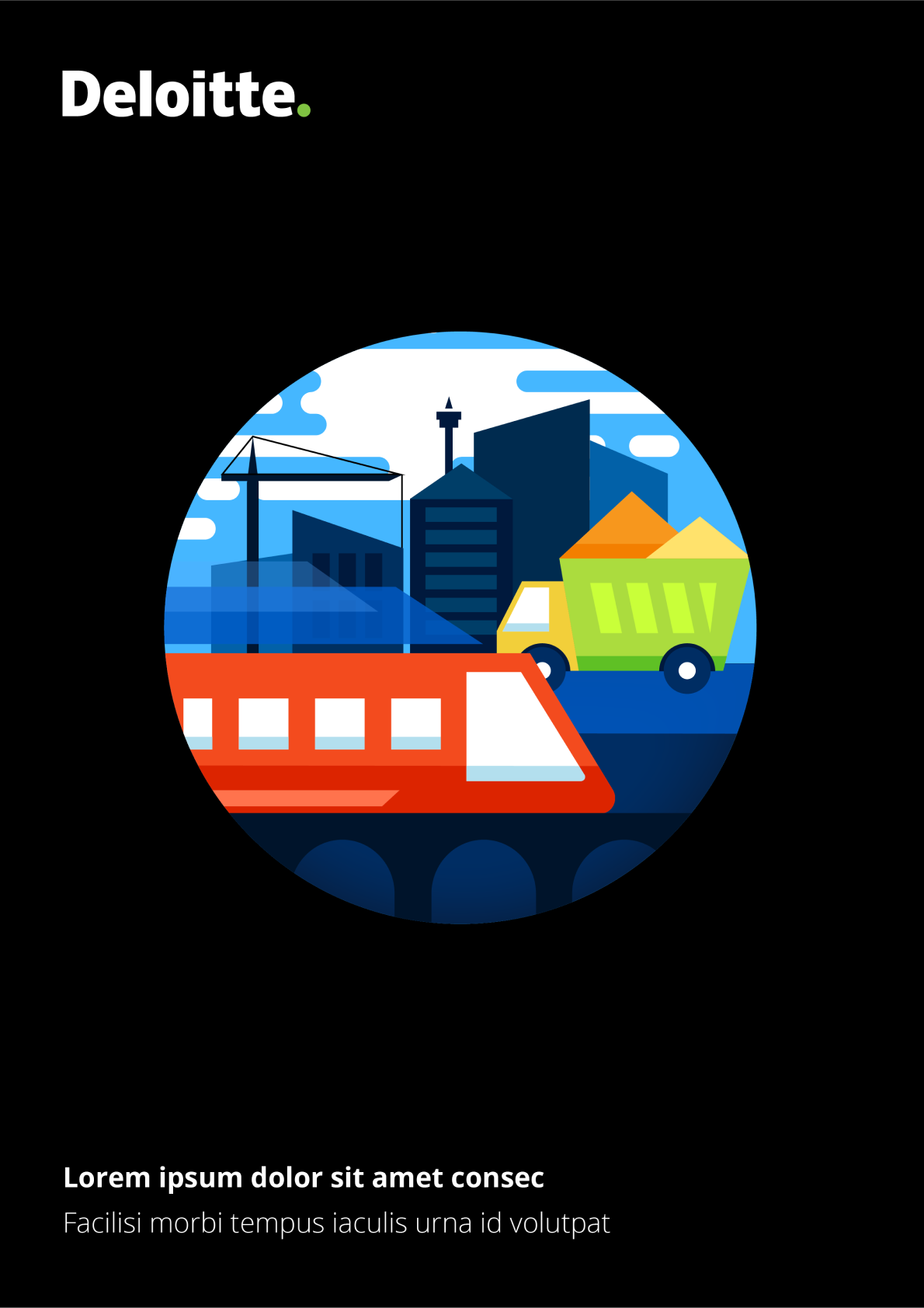
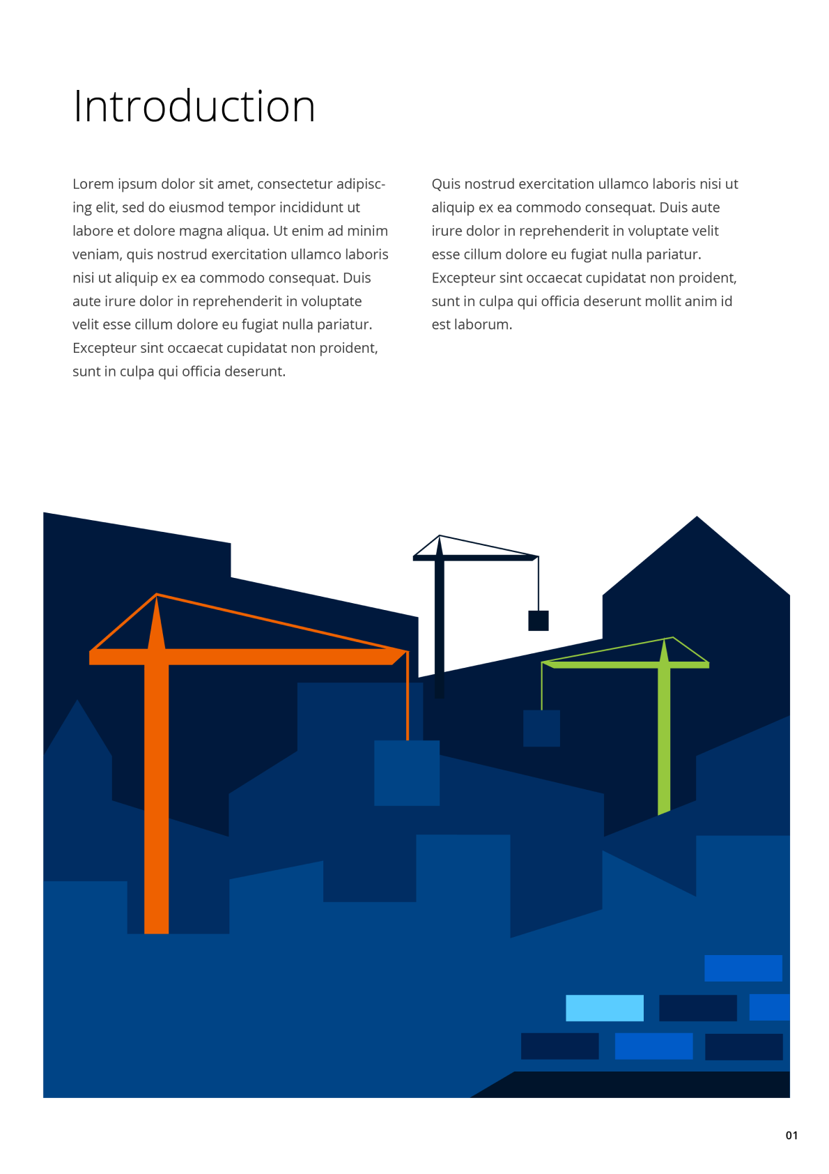
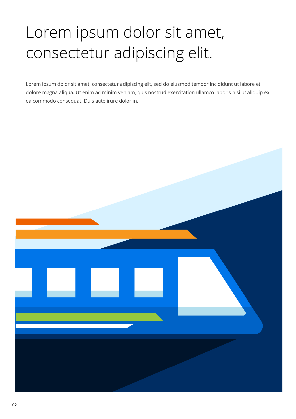
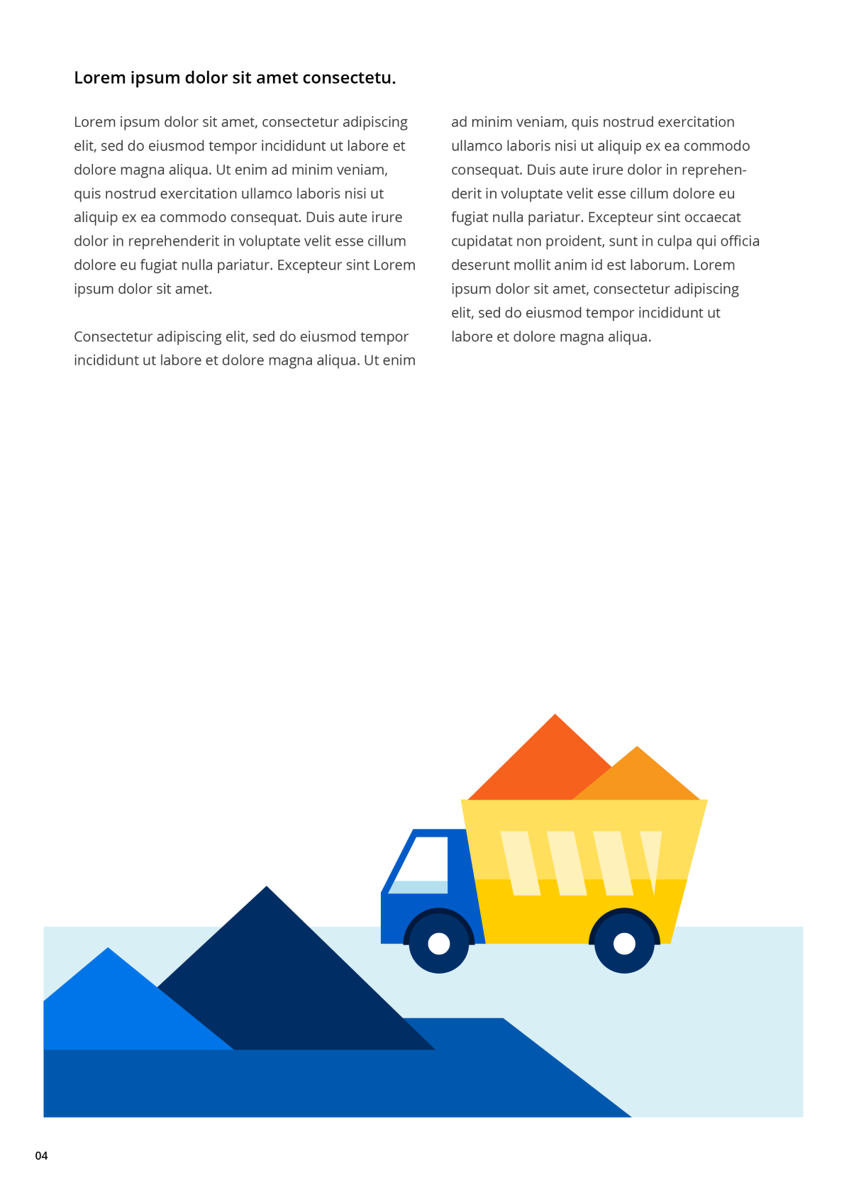
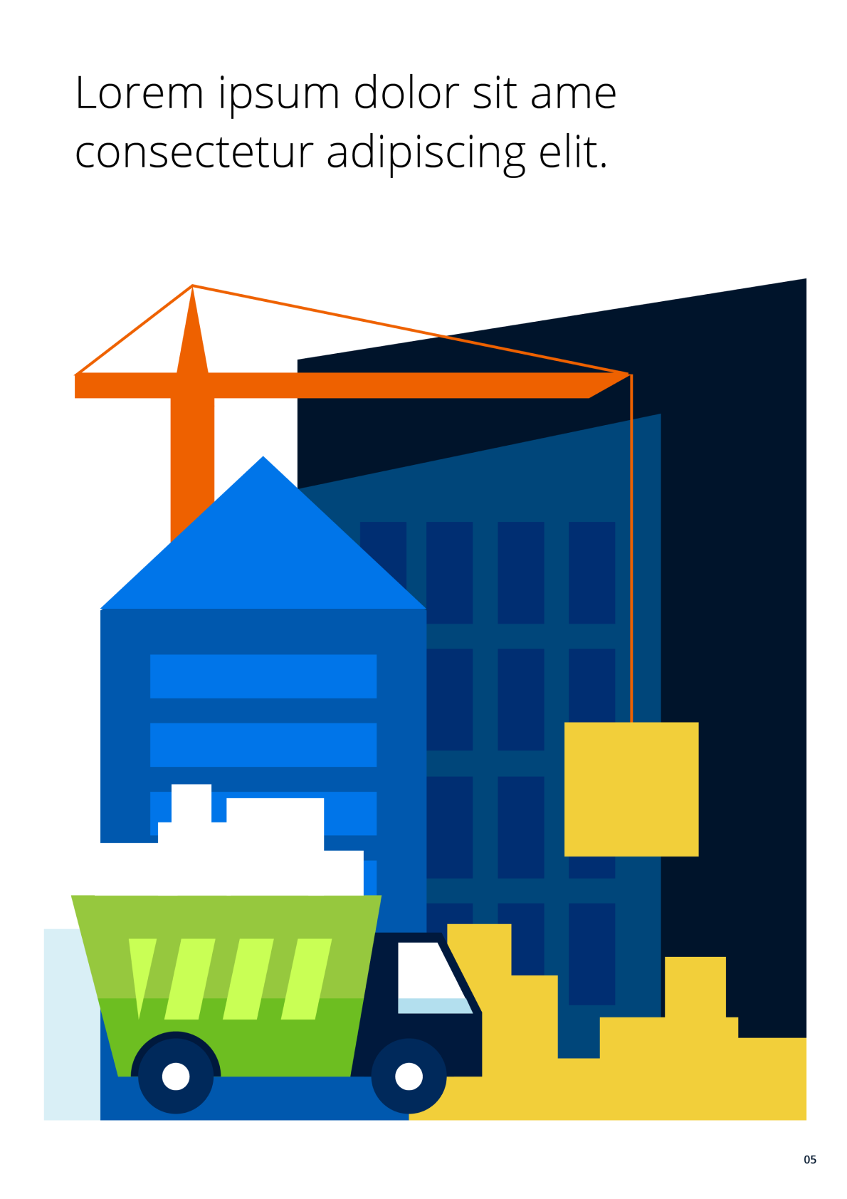
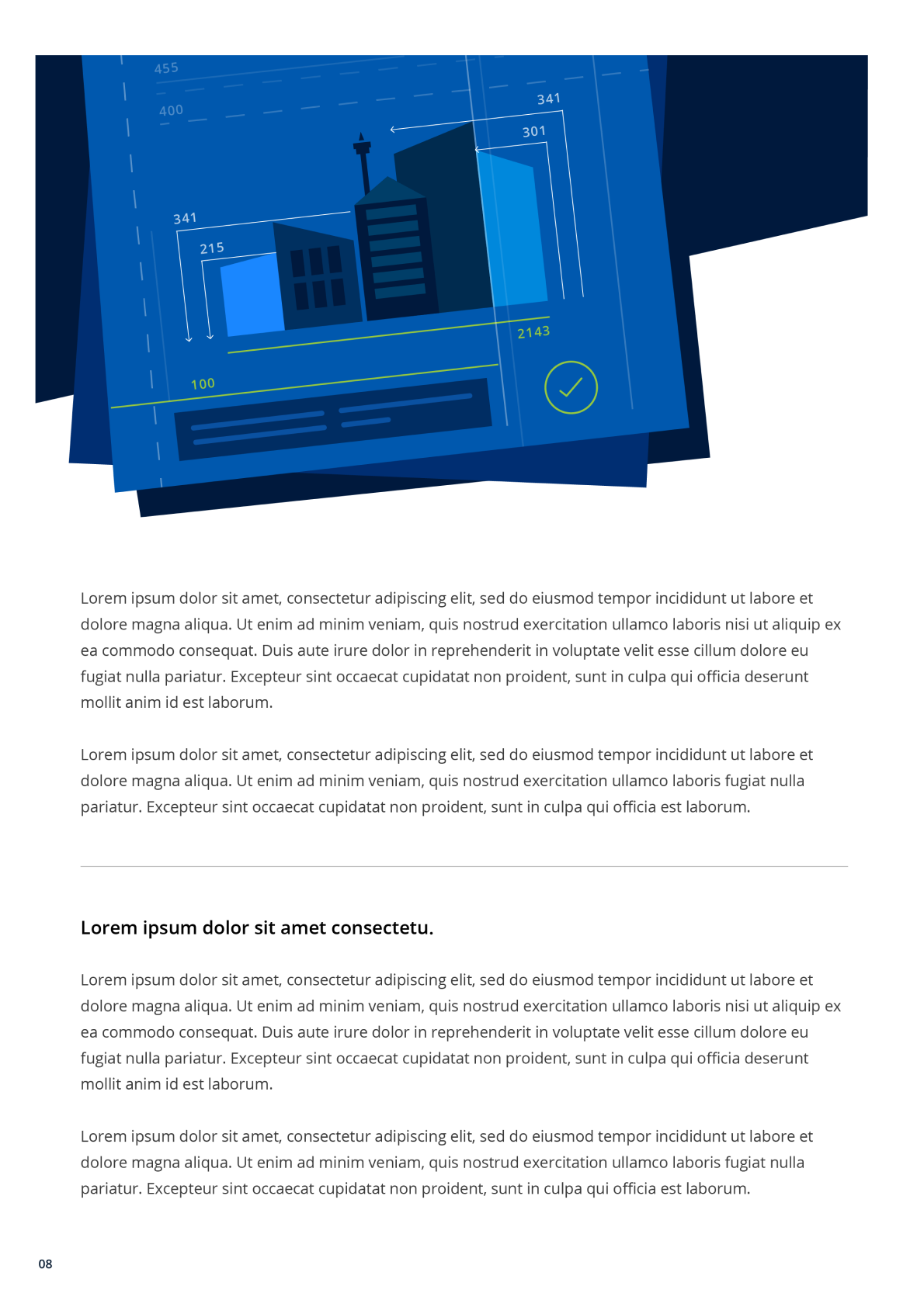
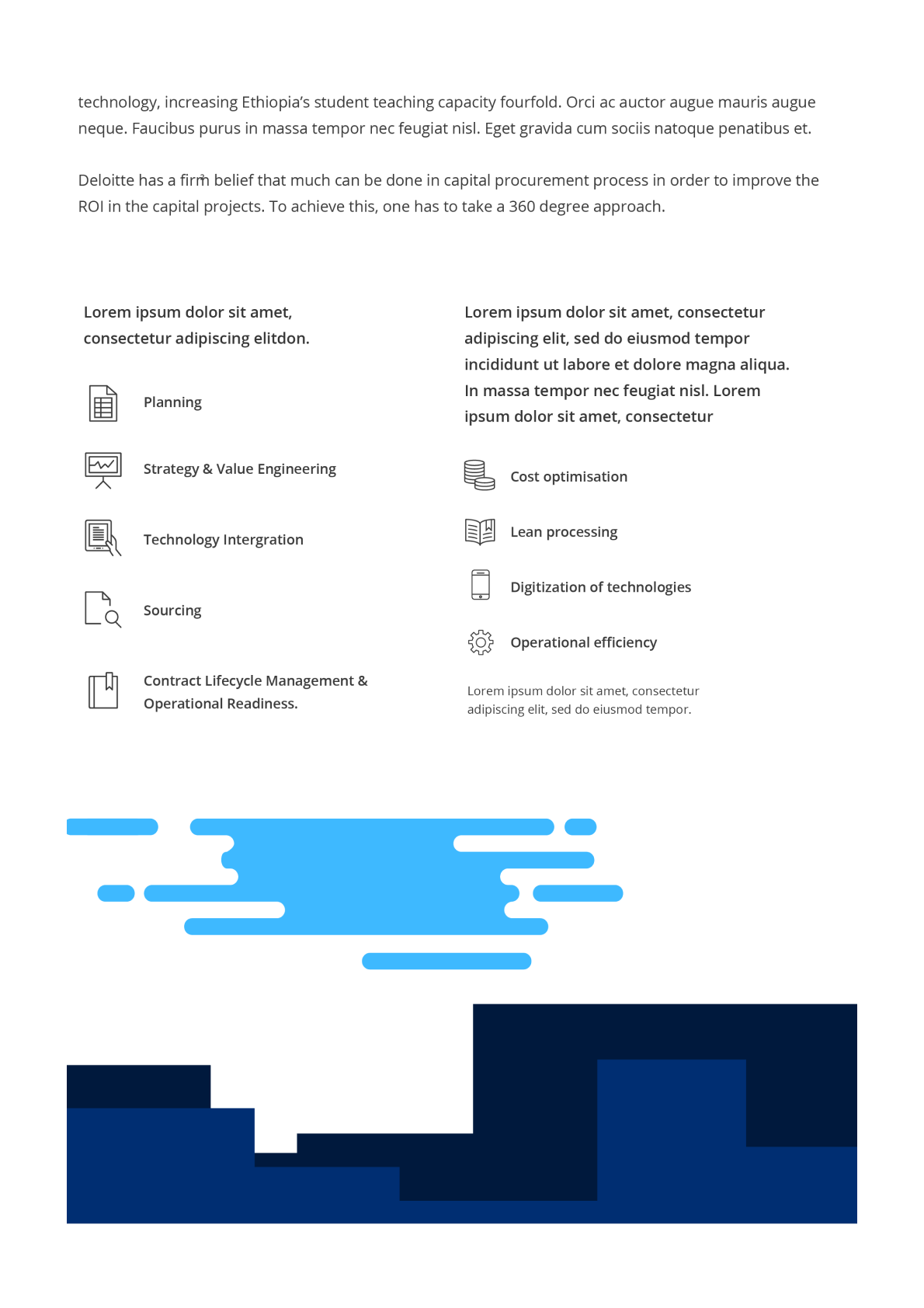
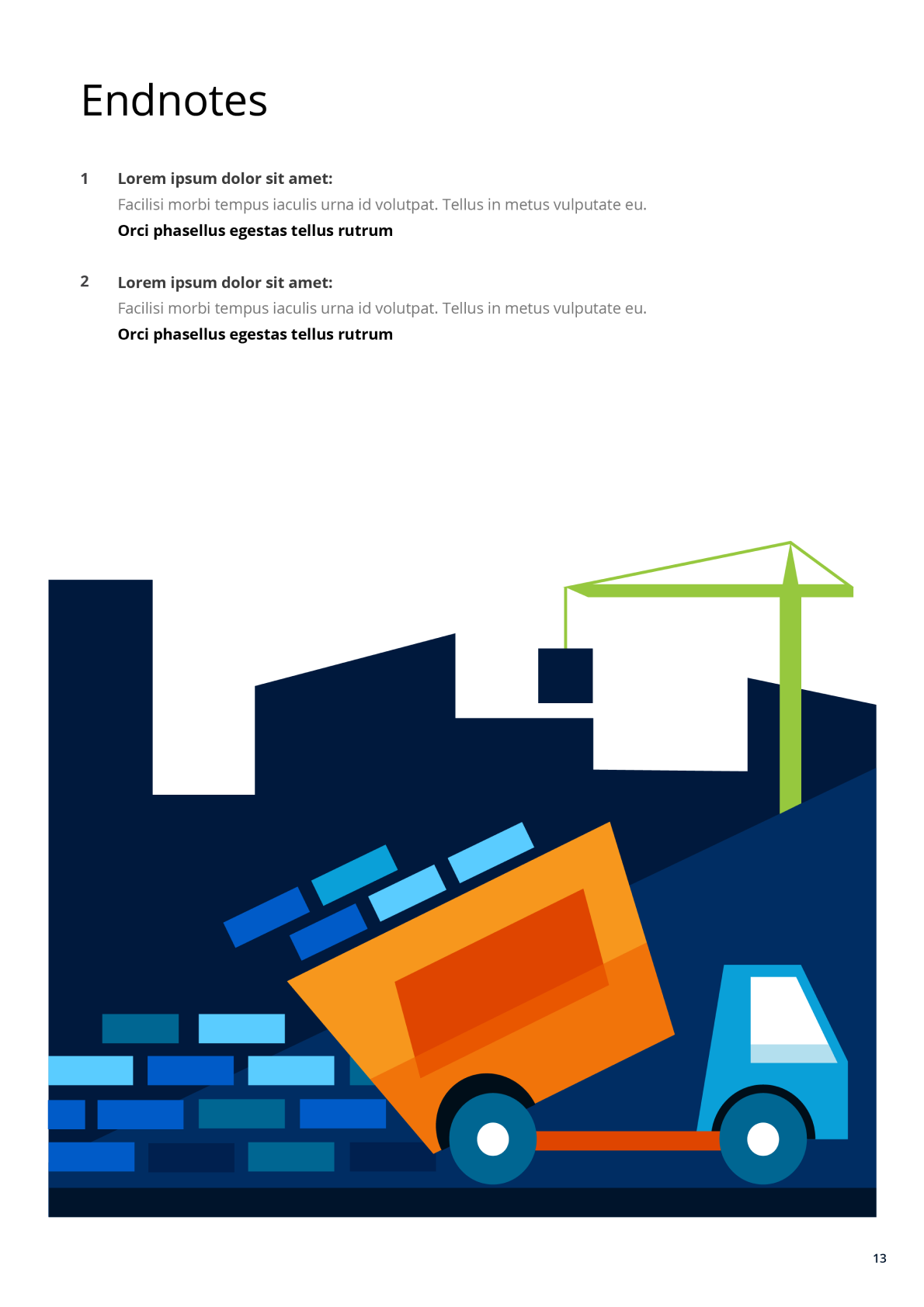
Construction report illustration
This illustration project was created for Deloitte as part of one of their annual brochures. The brief focused on visualizing key trends from their report titled “A Shift to More but Less: Africa Construction.” I was responsible not only for the illustrations—crafted to align with Deloitte’s corporate brand guidelines—but also for the overall layout design, ensuring the visuals and content flowed seamlessly throughout the publication.
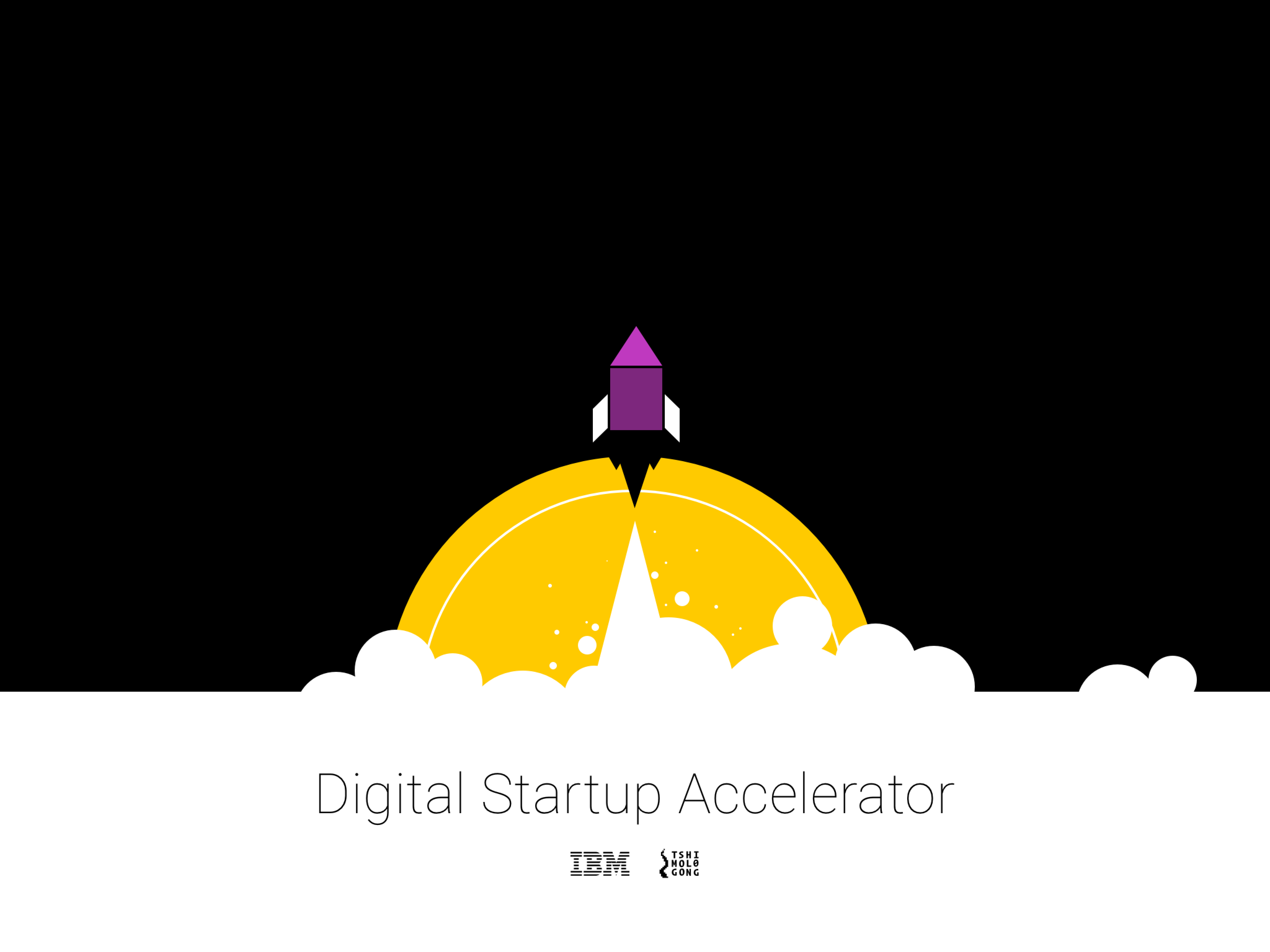
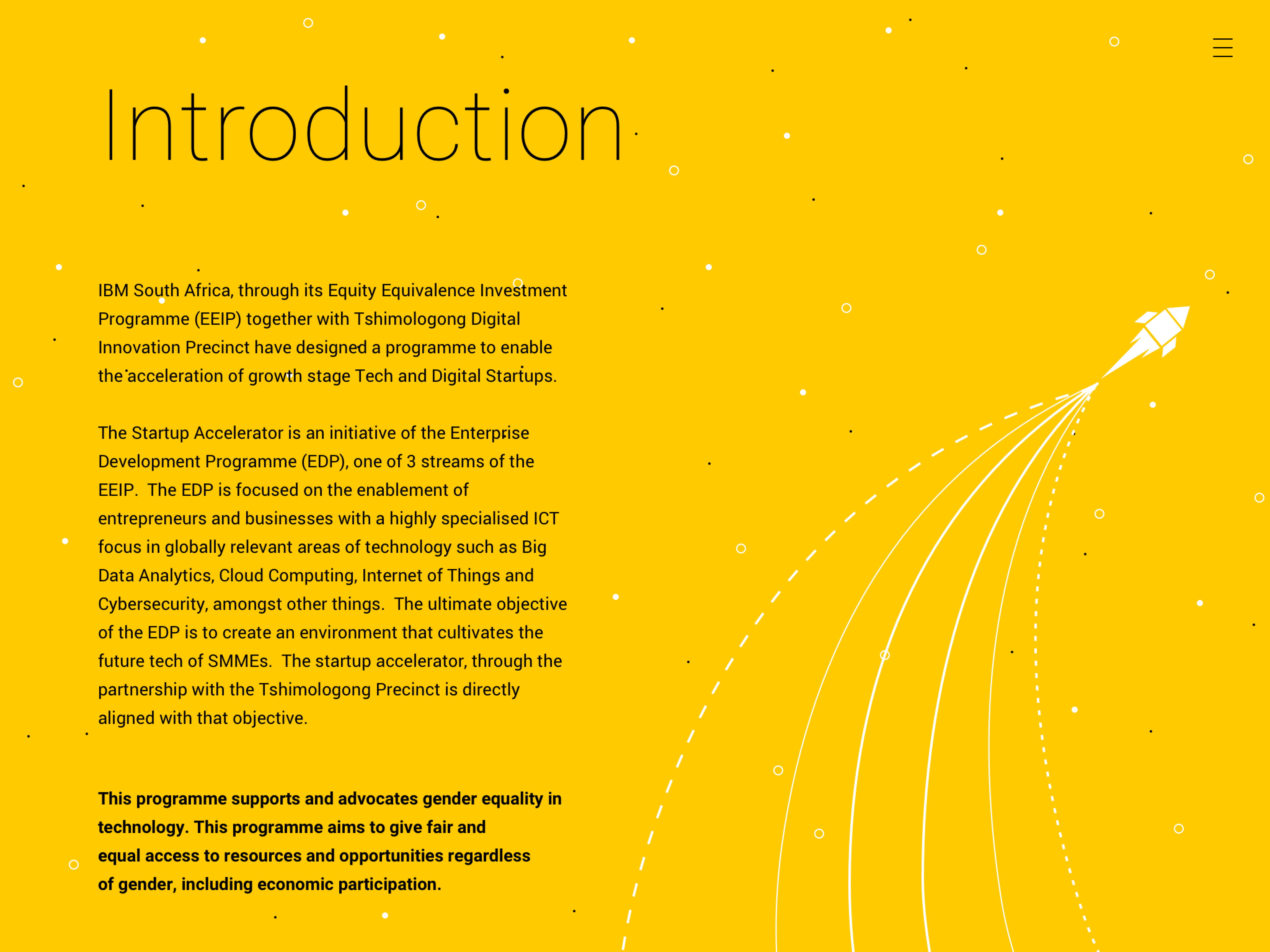
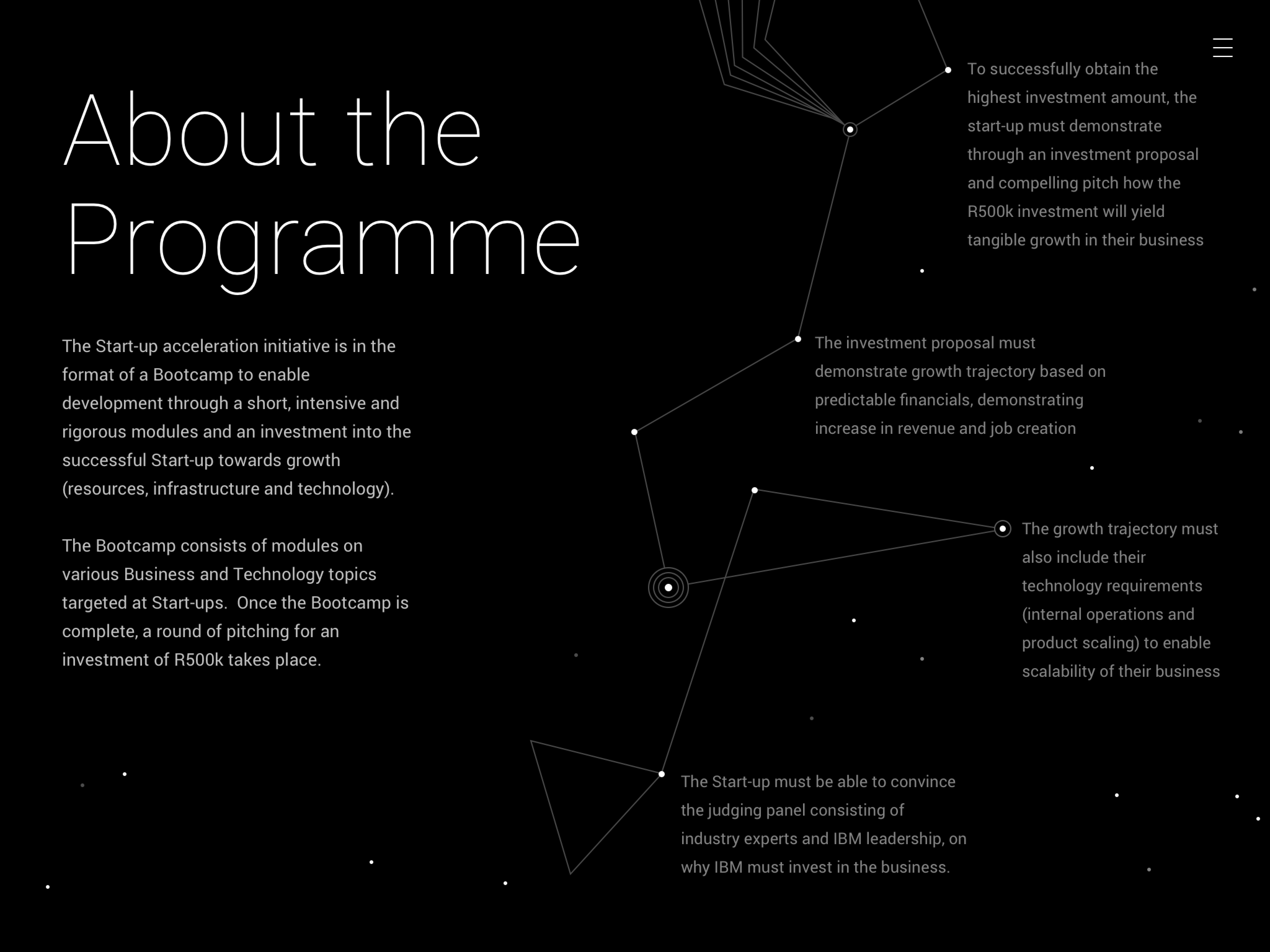
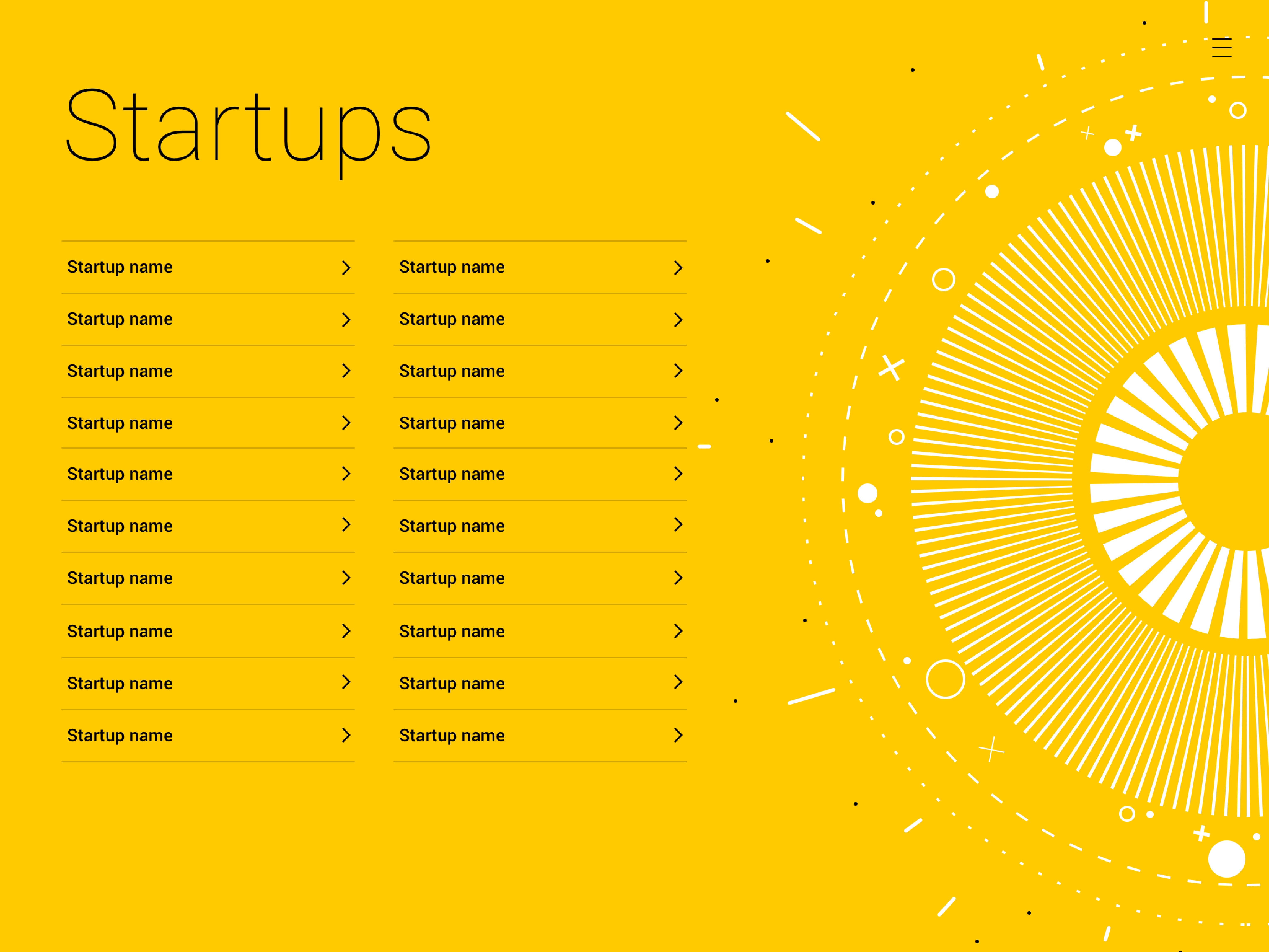
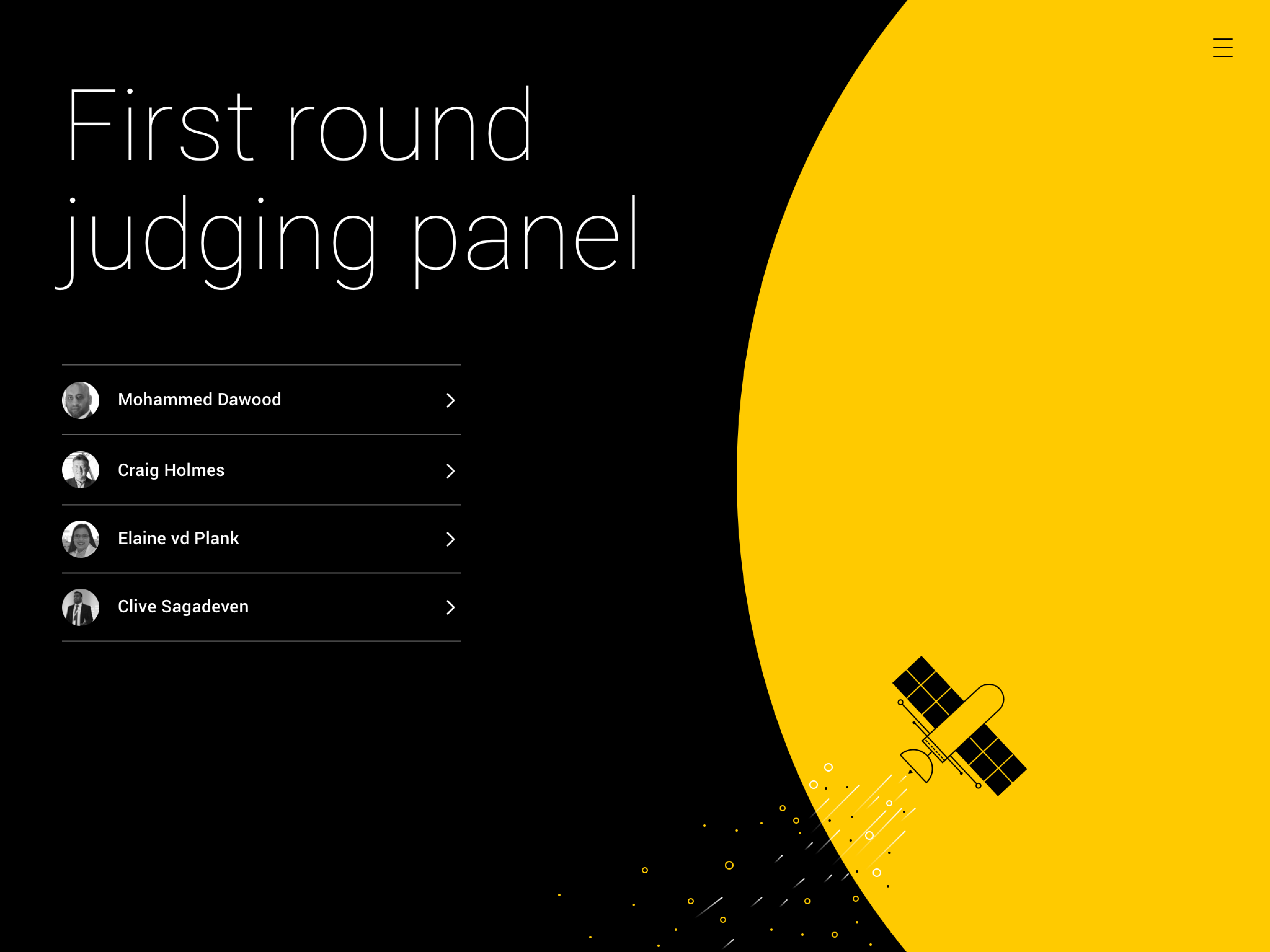
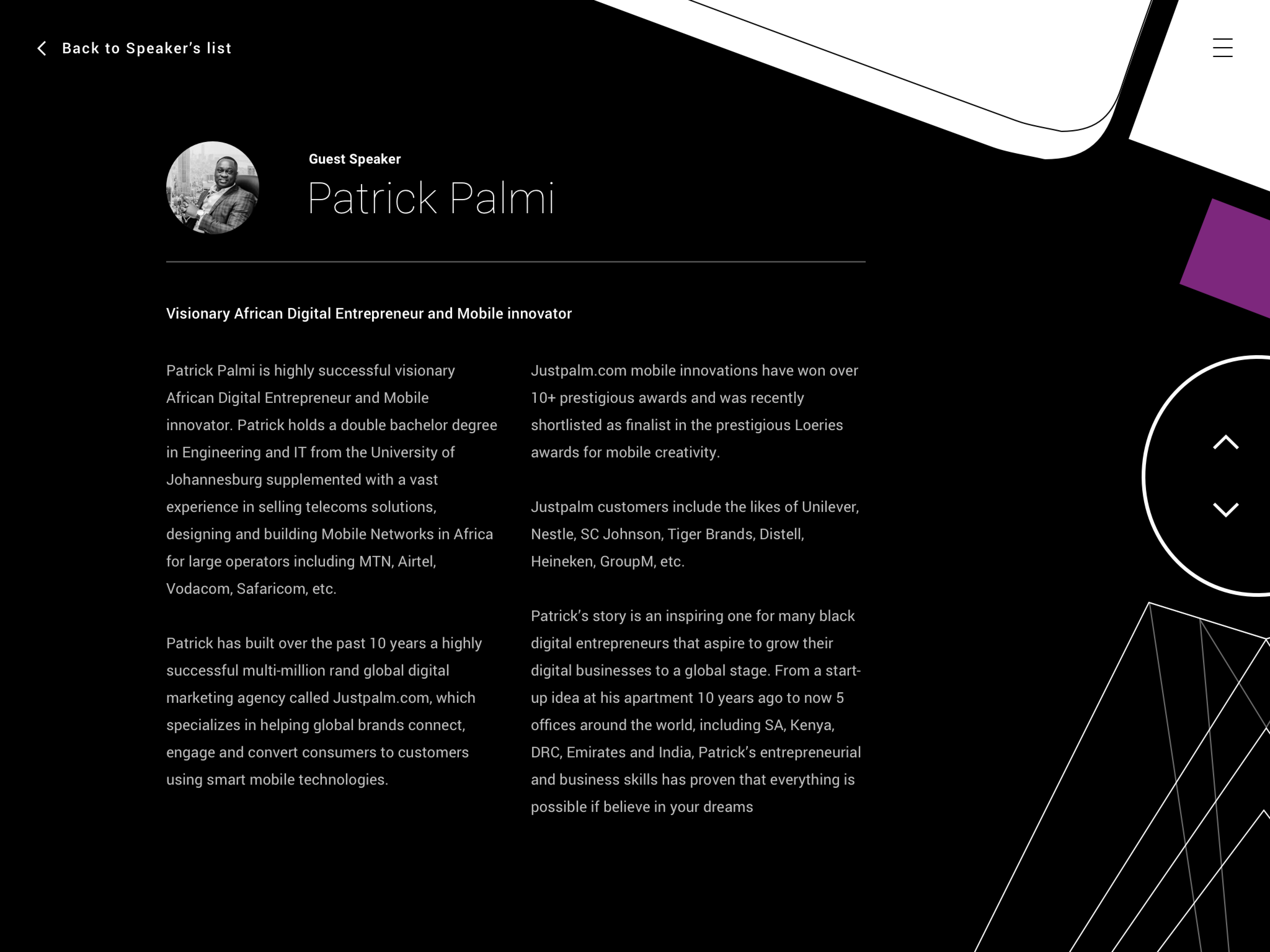
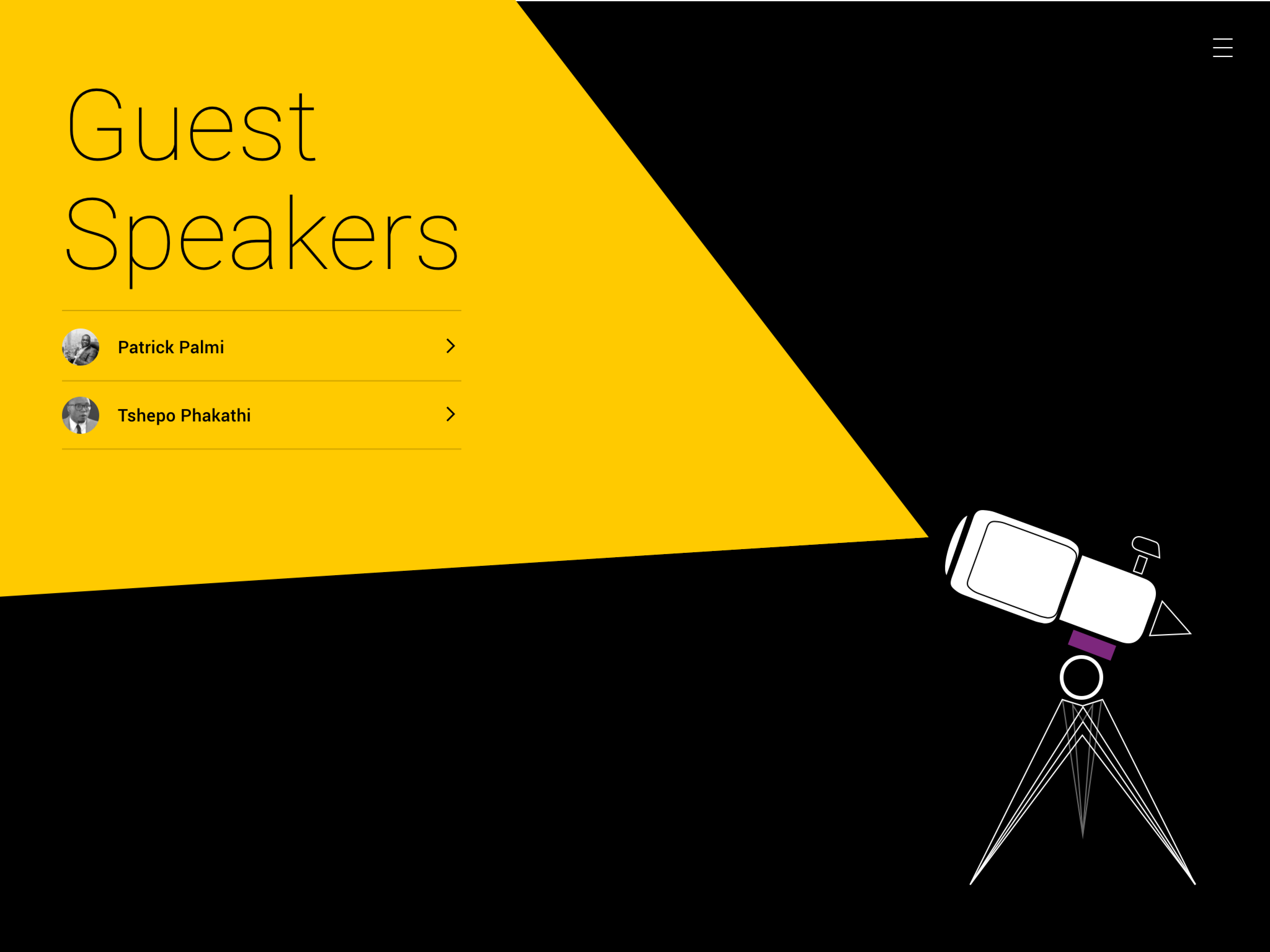
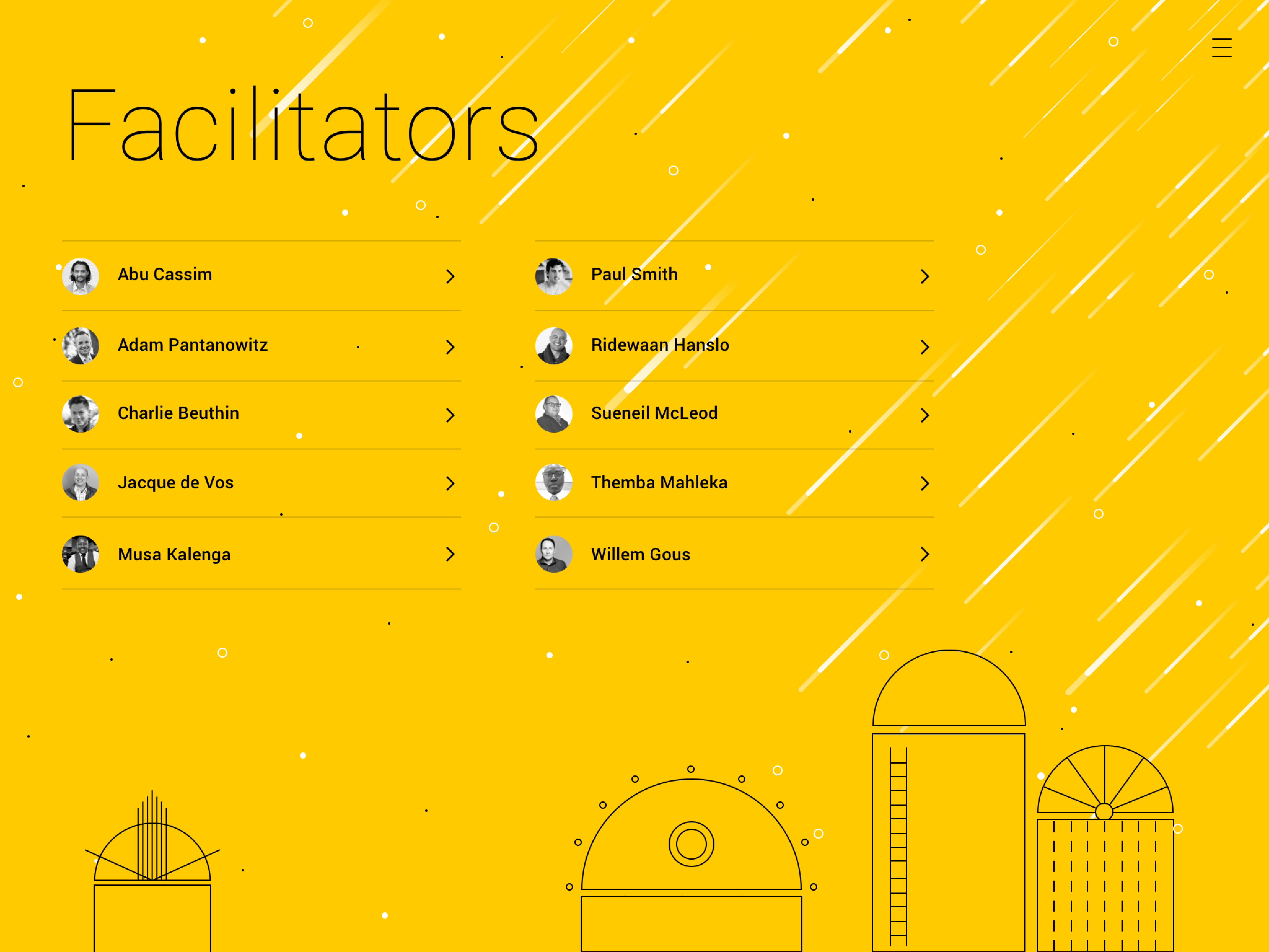
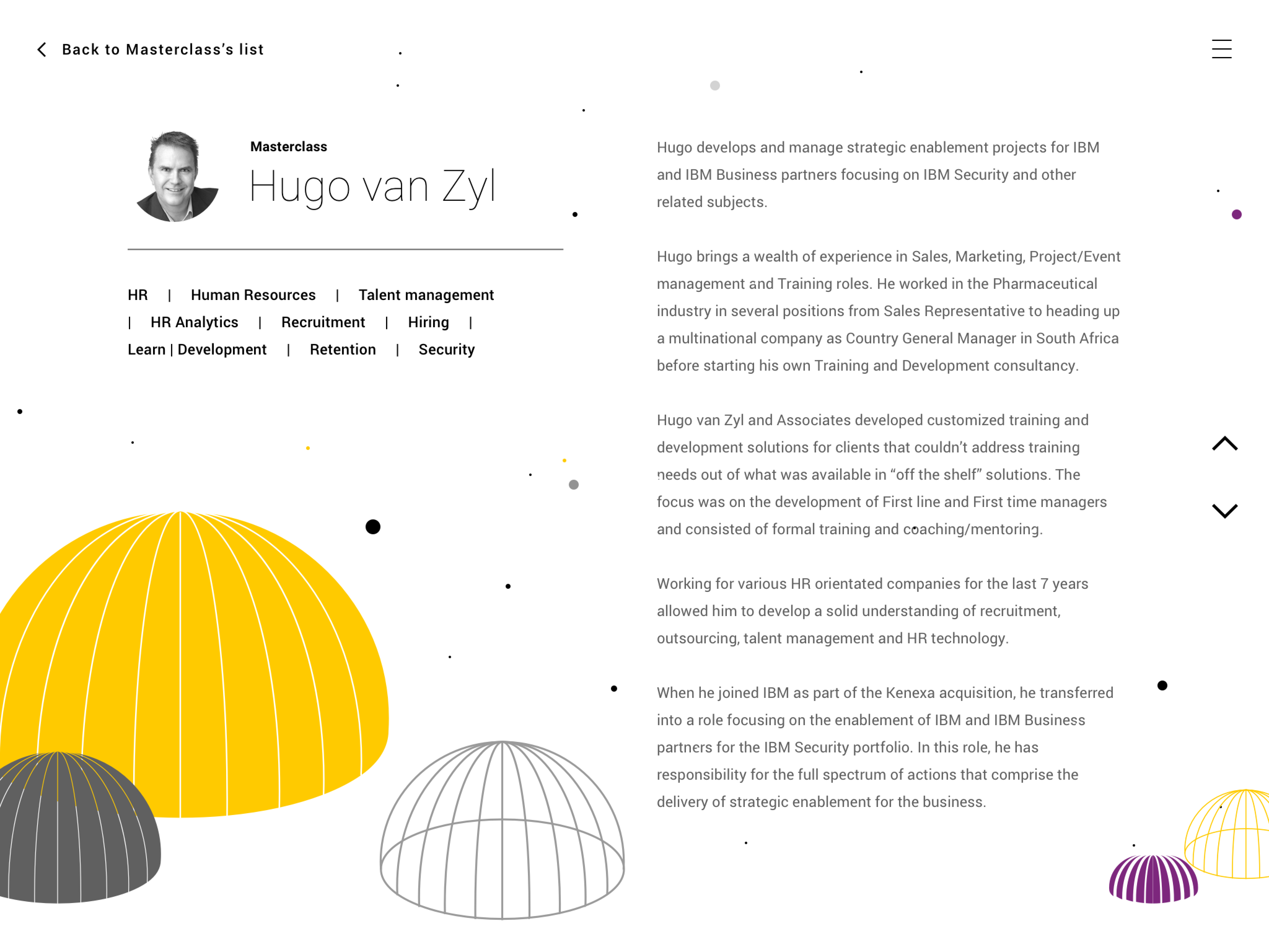
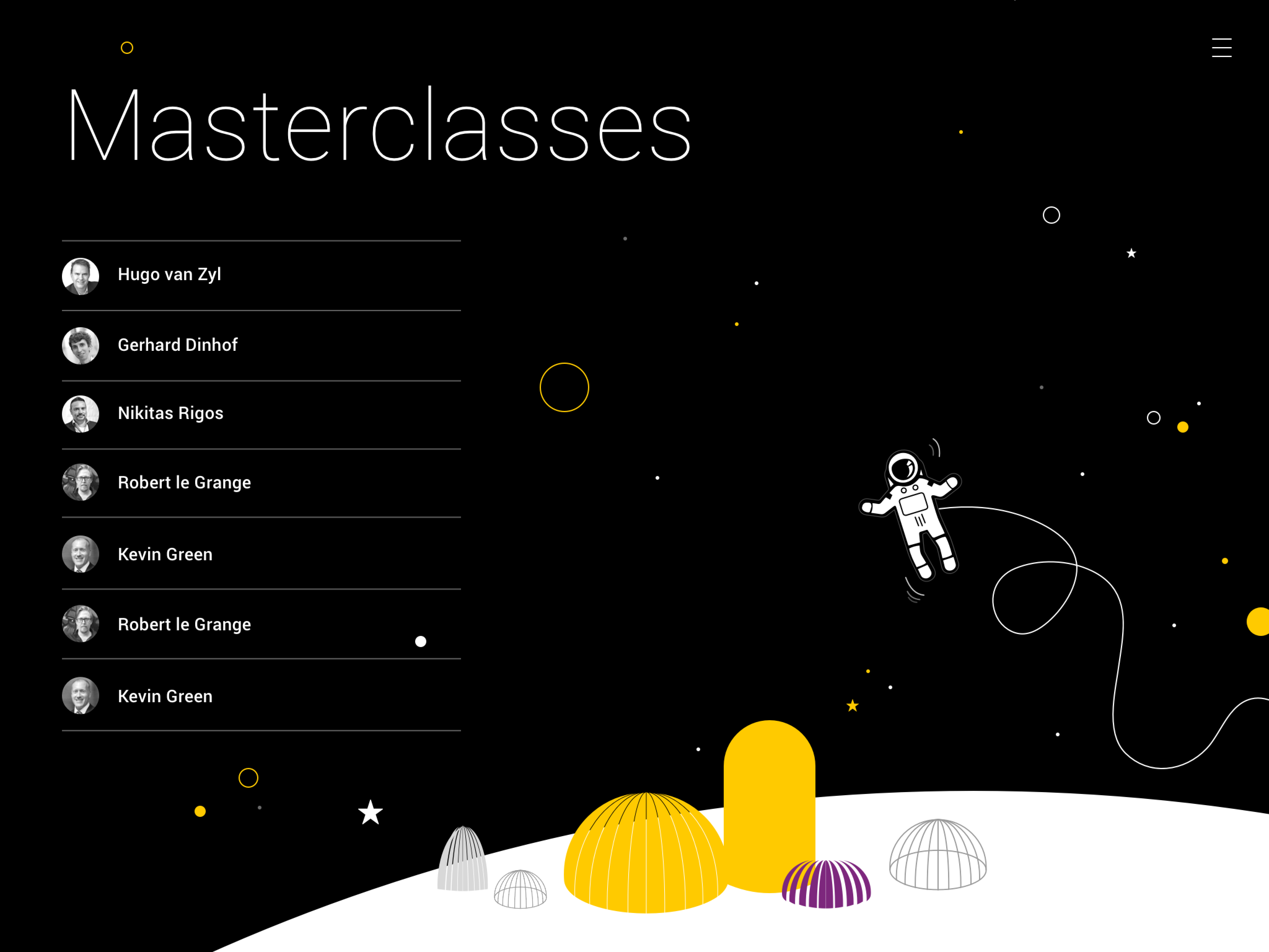
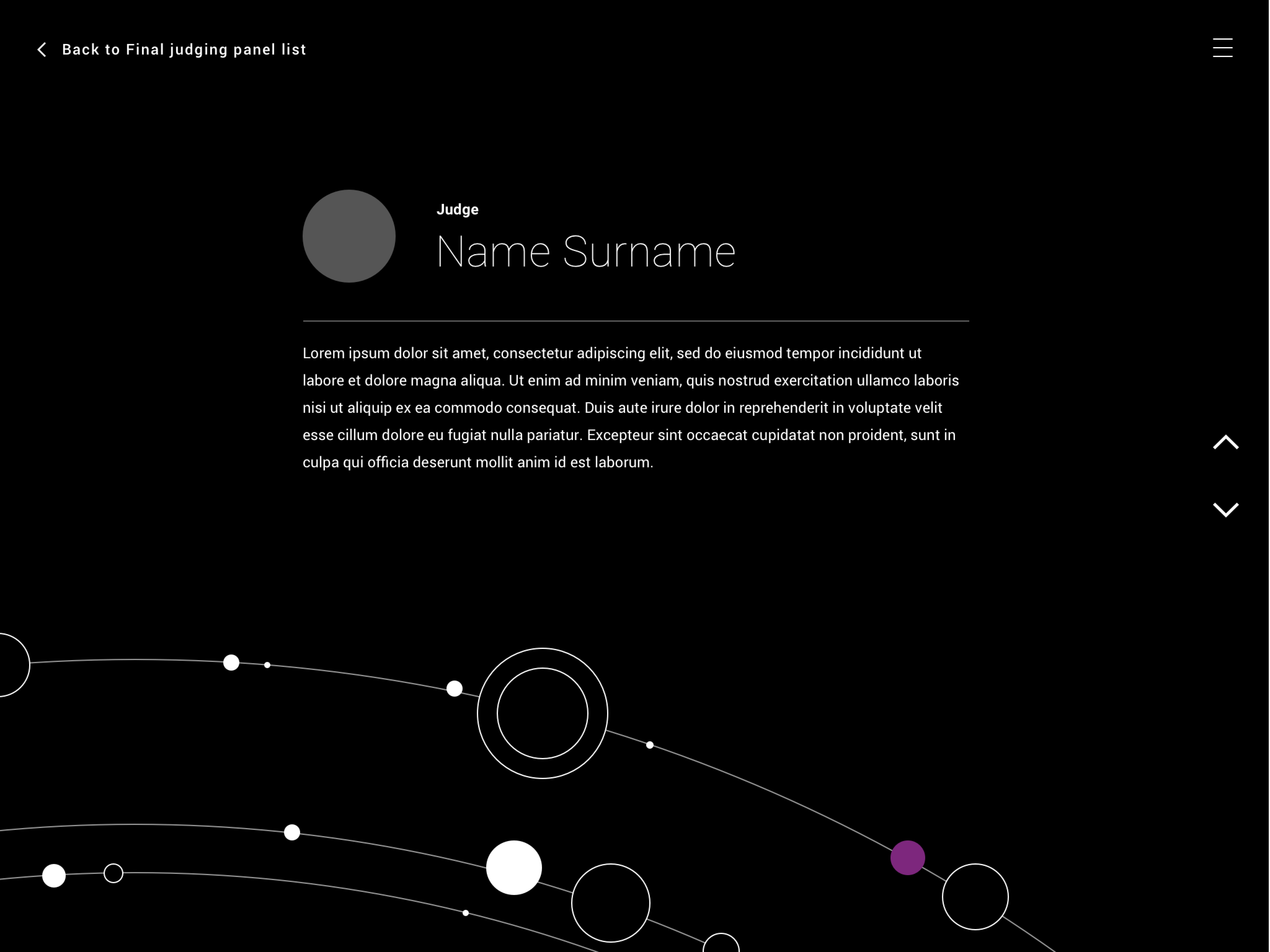
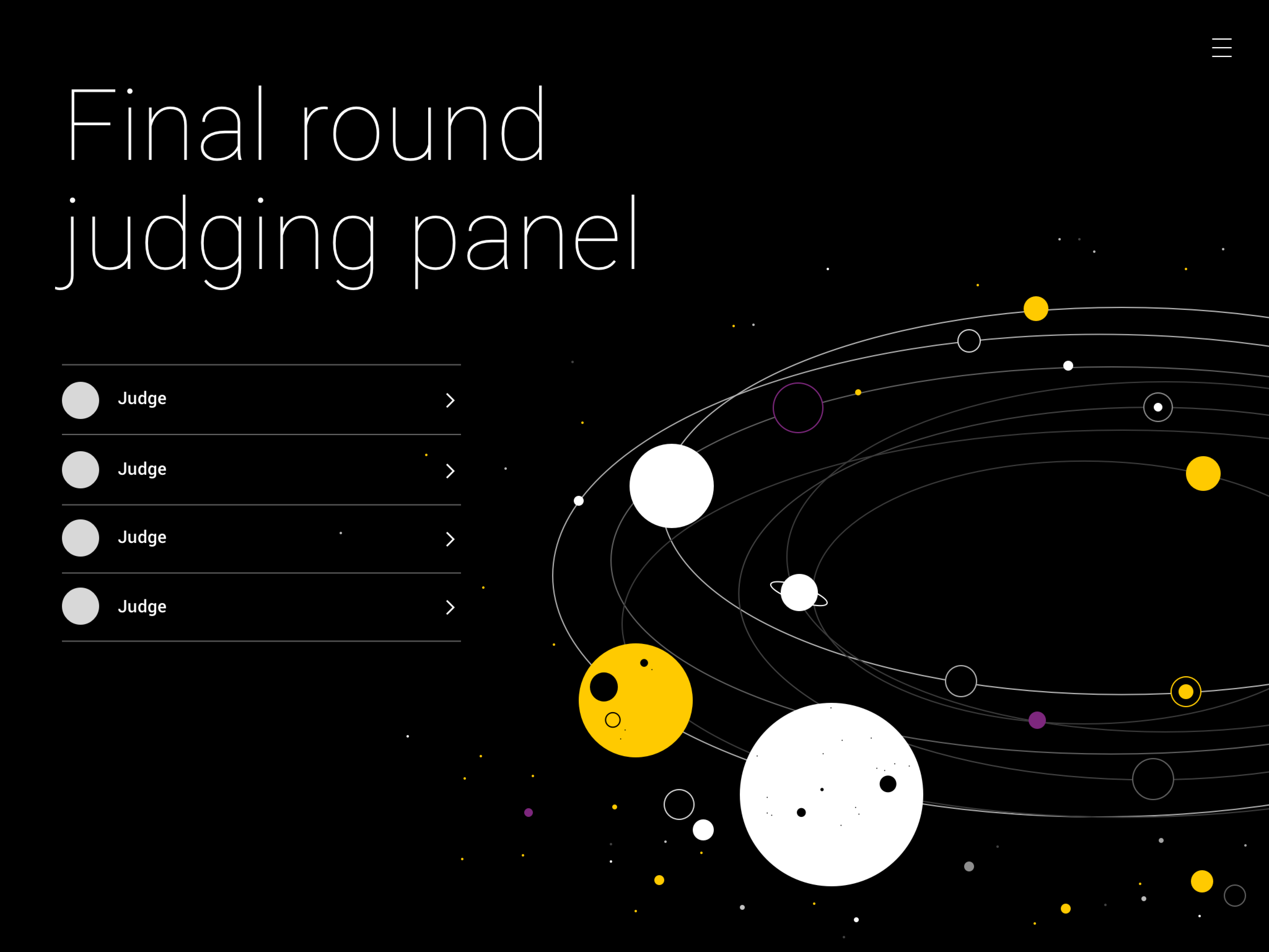
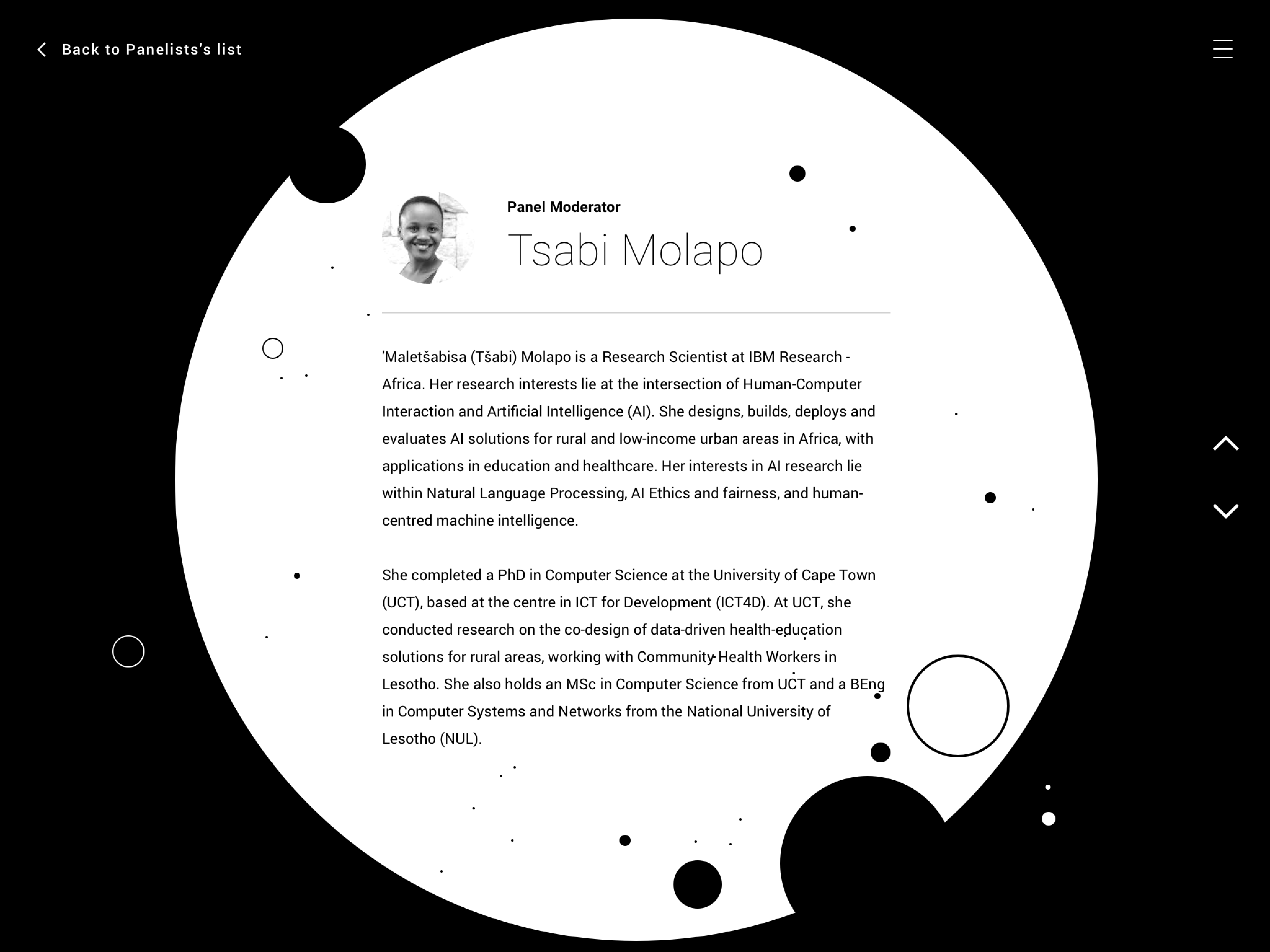
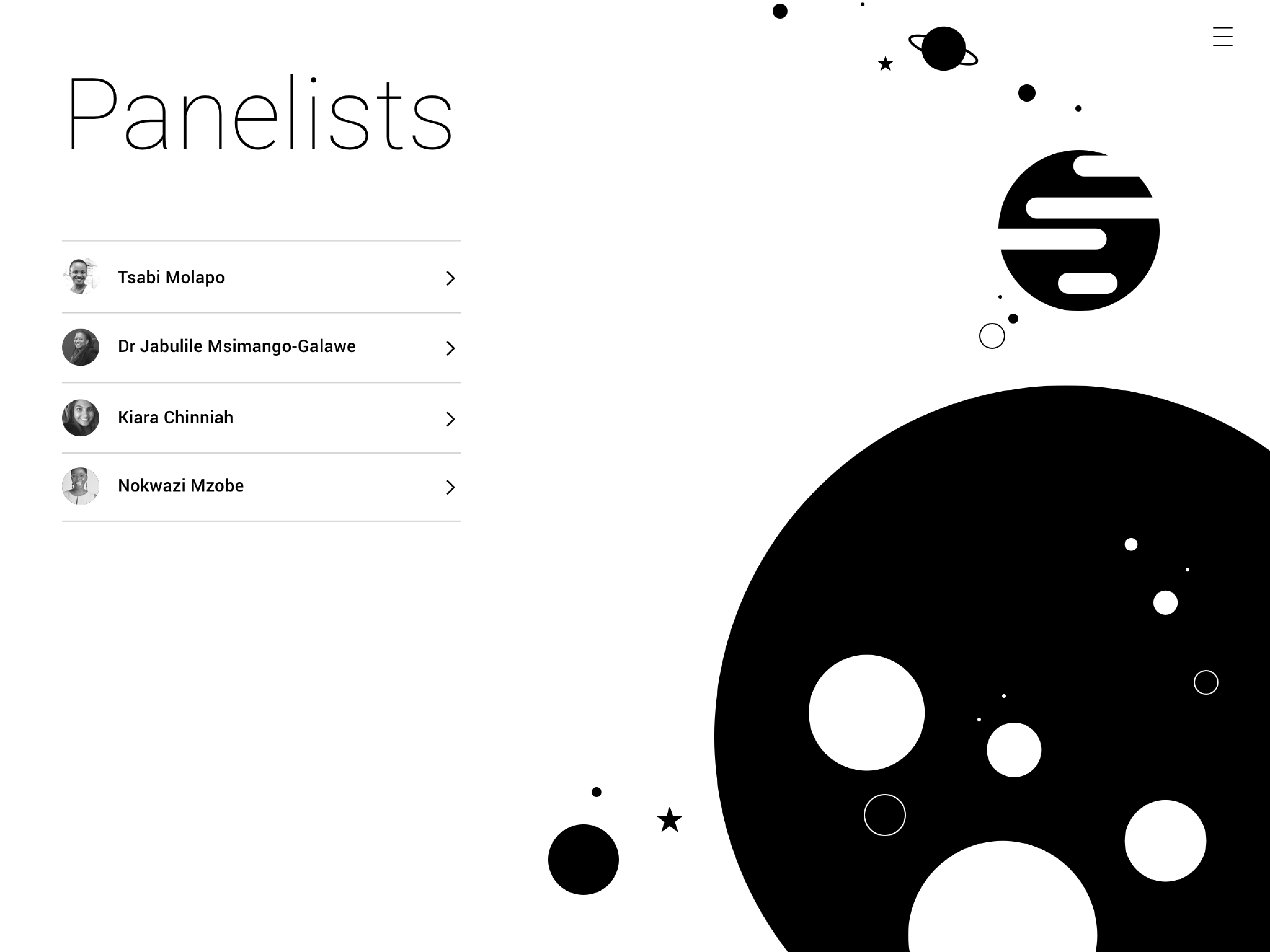
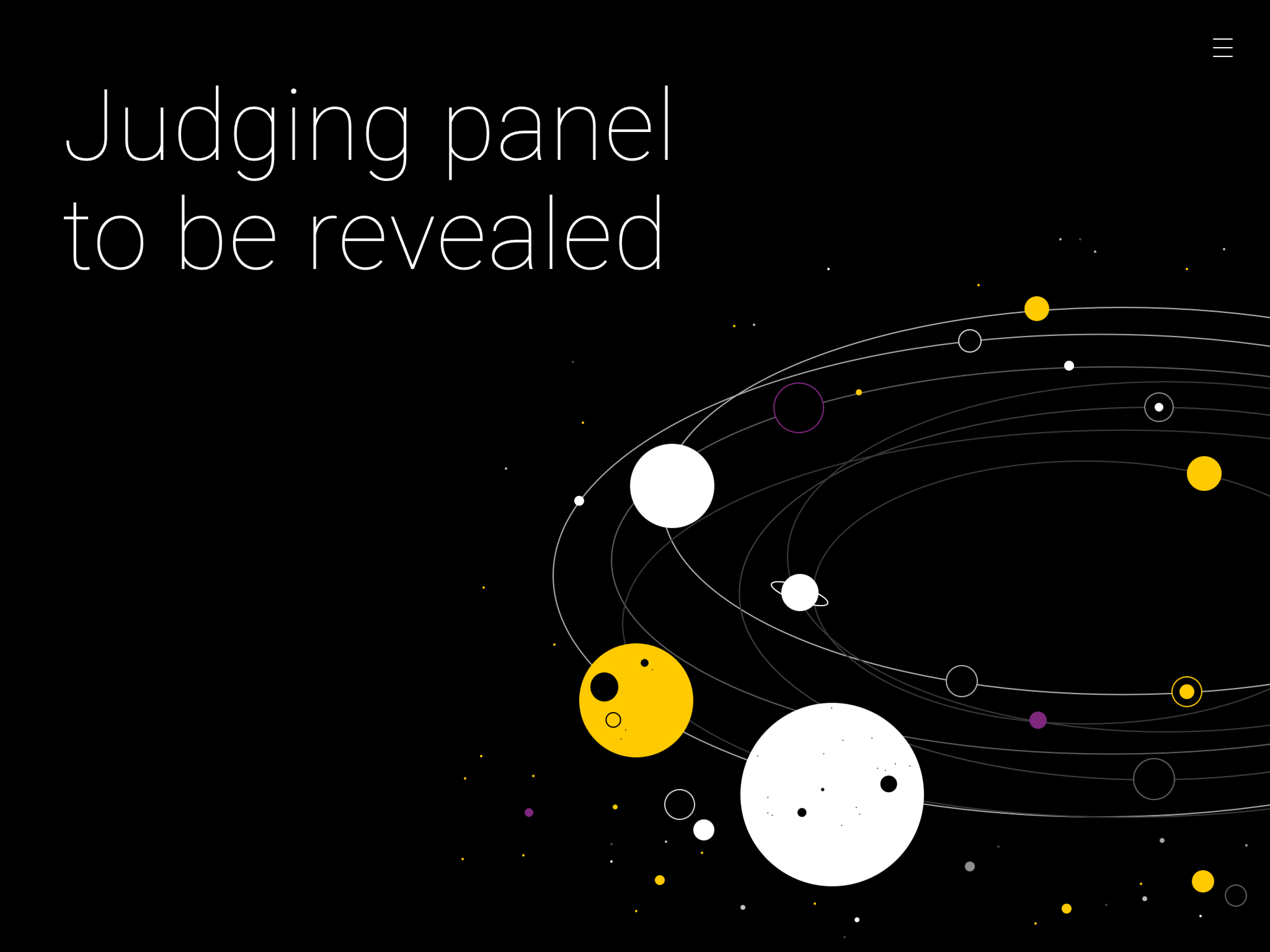
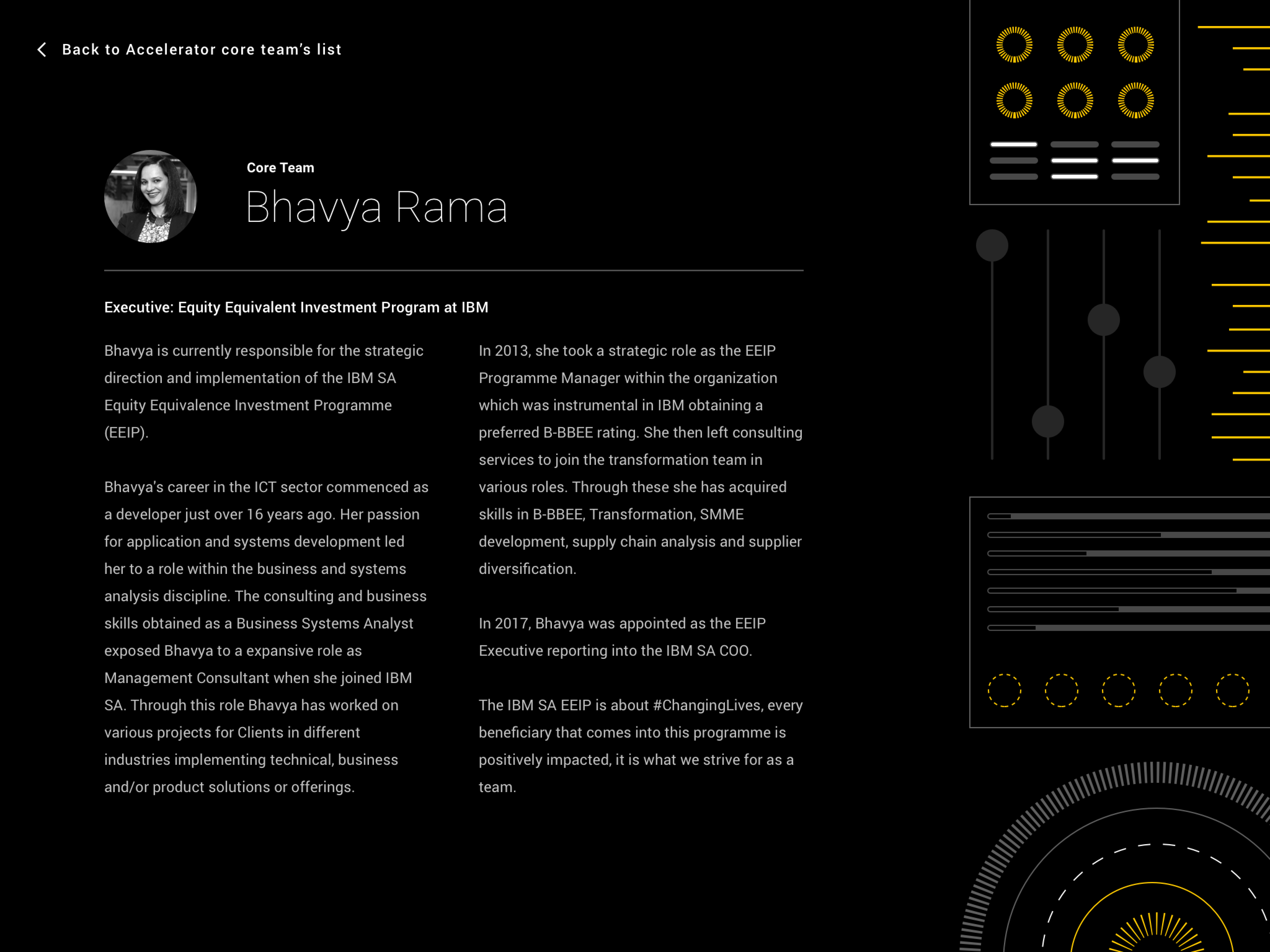
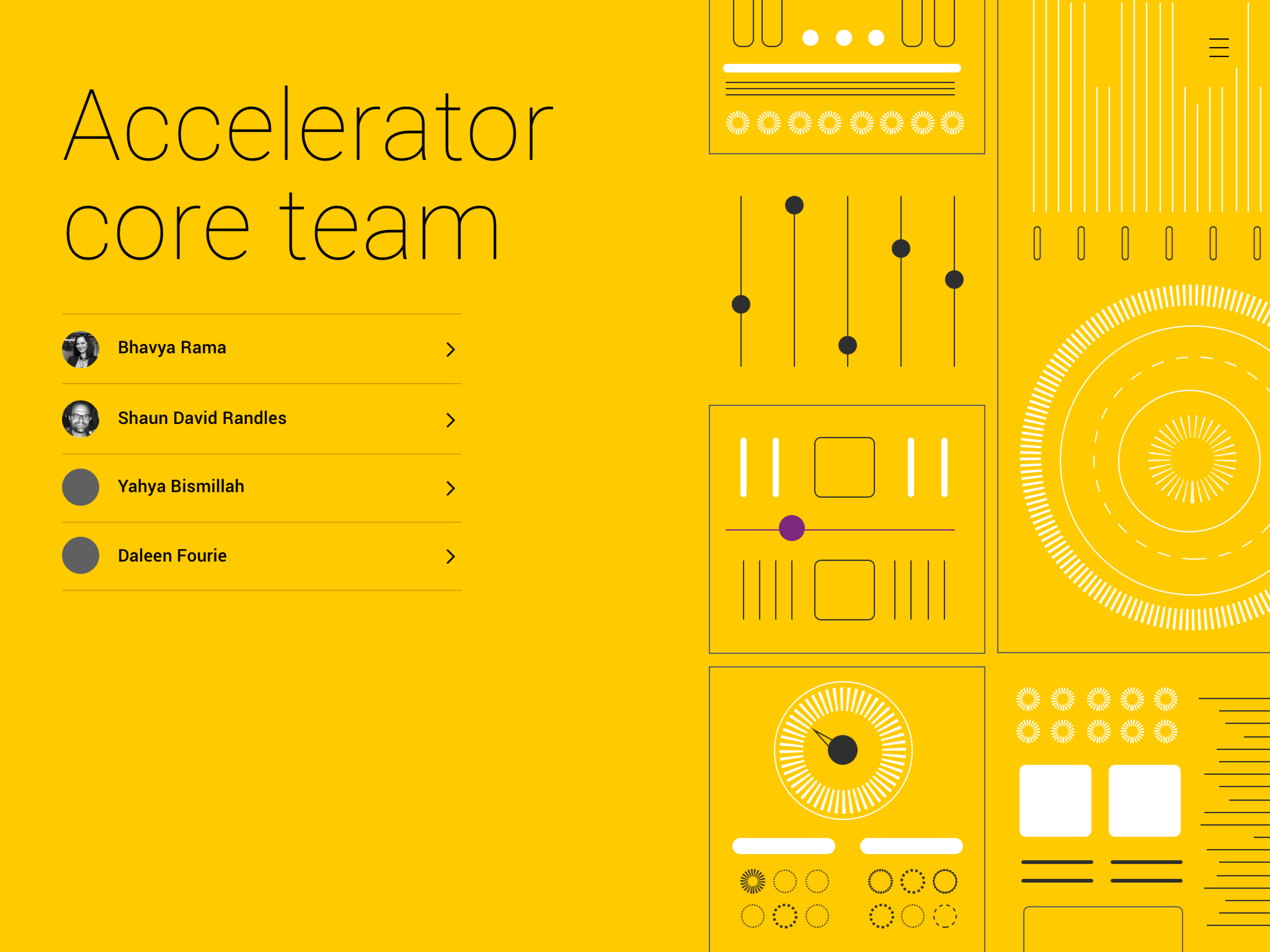
Startup bootcamp
This illustration project was developed for a Startup Bootcamp — a high-intensity acceleration initiative designed to fast-track startup growth through a series of short, rigorous modules. The program culminates in investment opportunities, providing successful startups with the resources, infrastructure, and technology needed to scale.
The visual concept draws inspiration from space exploration — a metaphor for ambition, limitless potential, and bold journeys into the unknown. Just like aiming for the stars, these entrepreneurs are venturing into new frontiers, and the galaxy-themed illustrations reflect the vast opportunities that lie ahead.
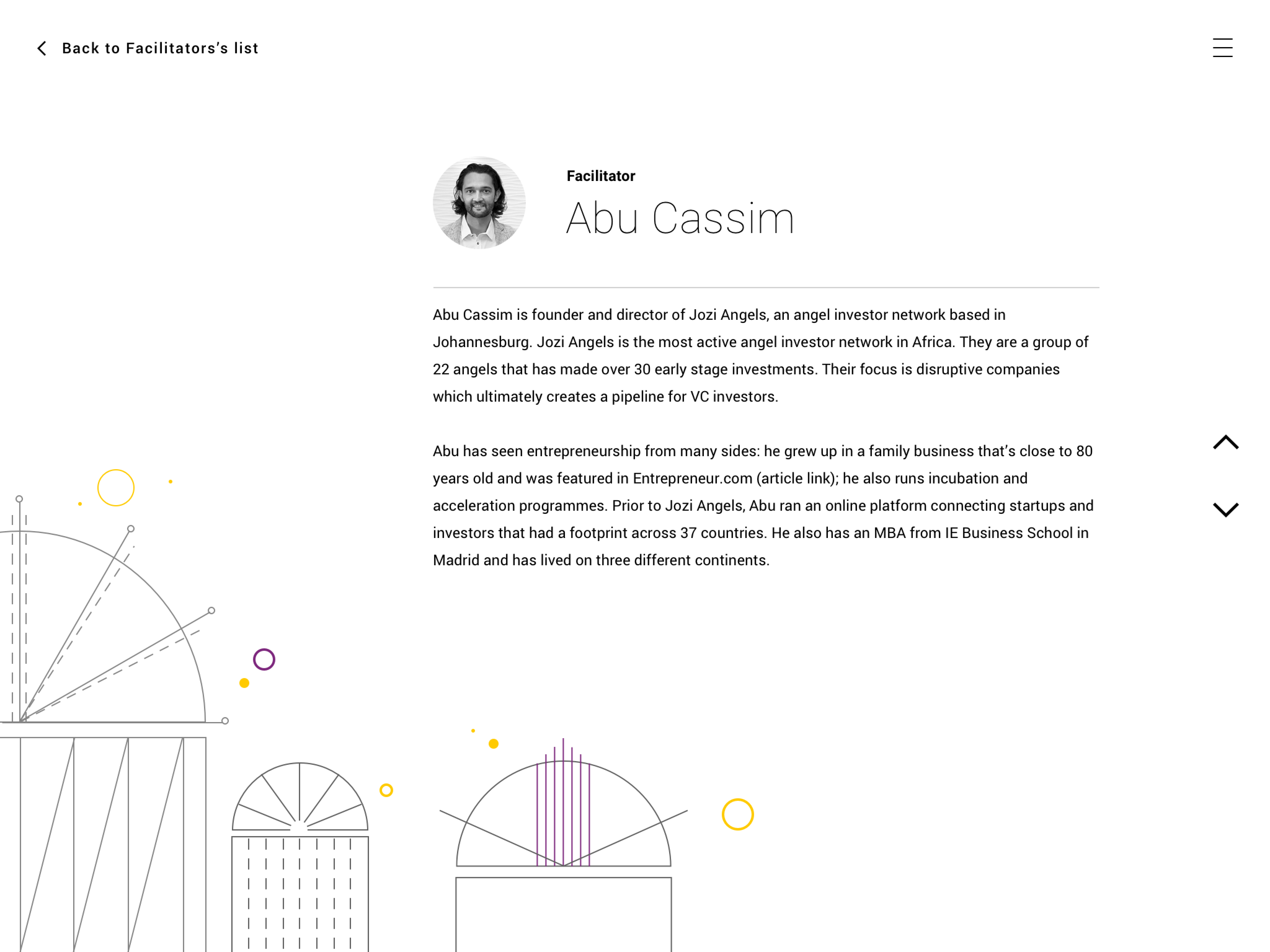
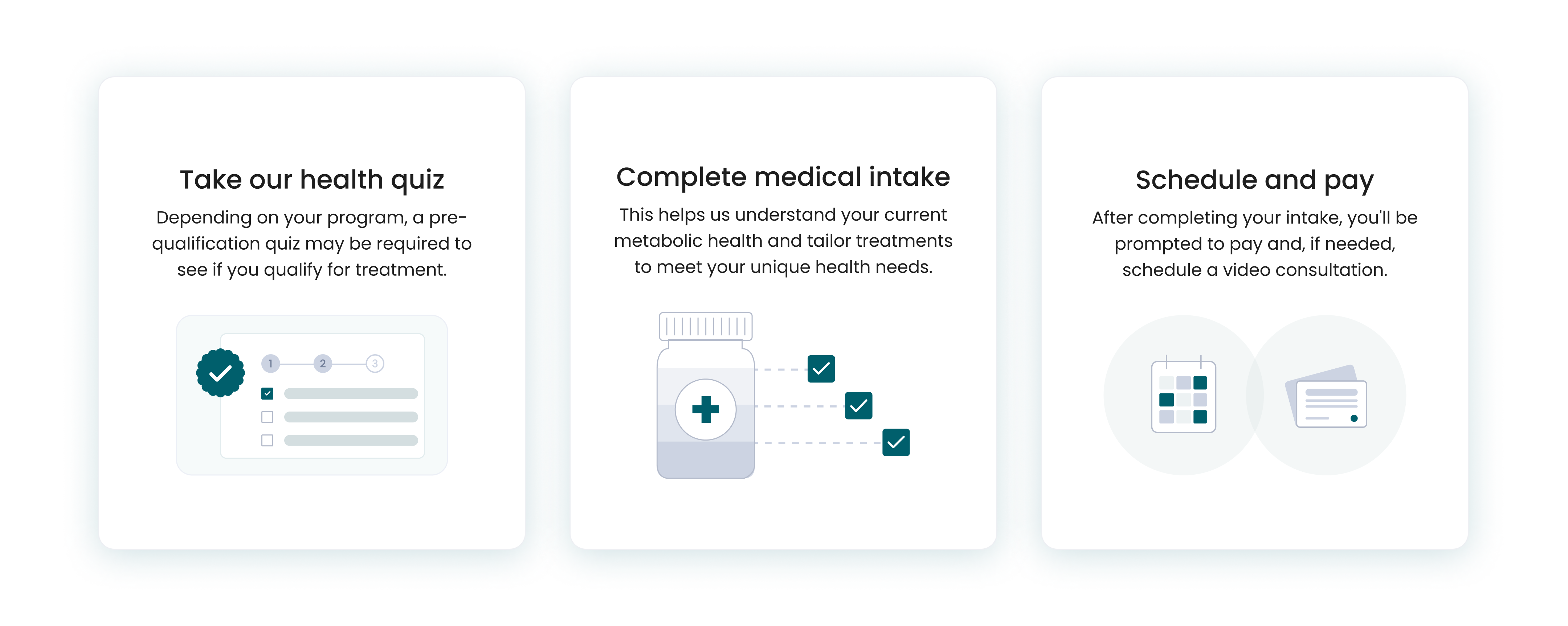
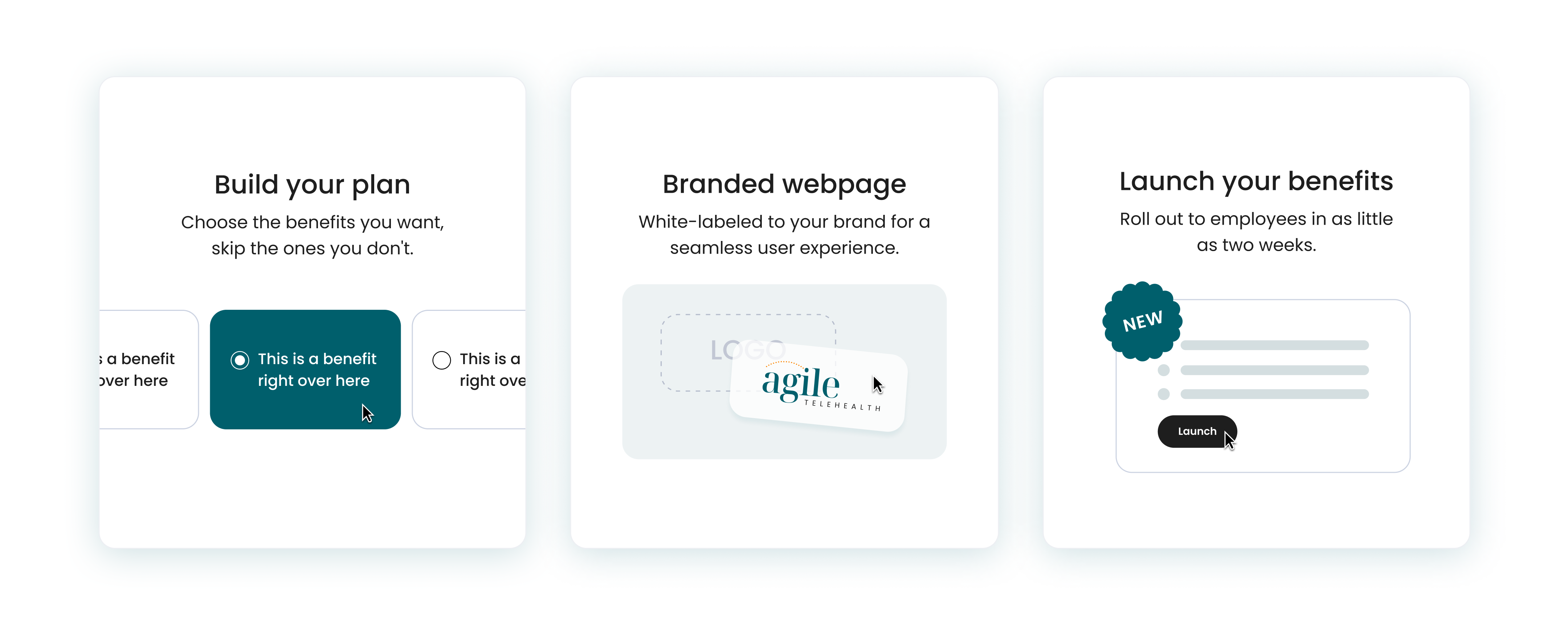
Clean, medical illustration
These illustrations feature a clean, minimal style tailored specifically for medical and health-related content. Designed for a health-focused website, the graphics aim to communicate complex information in a clear, approachable, and visually engaging way. The illustrations strike a balance between professionalism and accessibility—using simplified forms, muted color palettes, and precise line work to support clarity without overwhelming the viewer. Every element is thoughtfully crafted to enhance user understanding while maintaining a cohesive visual identity aligned with the site’s purpose and tone.
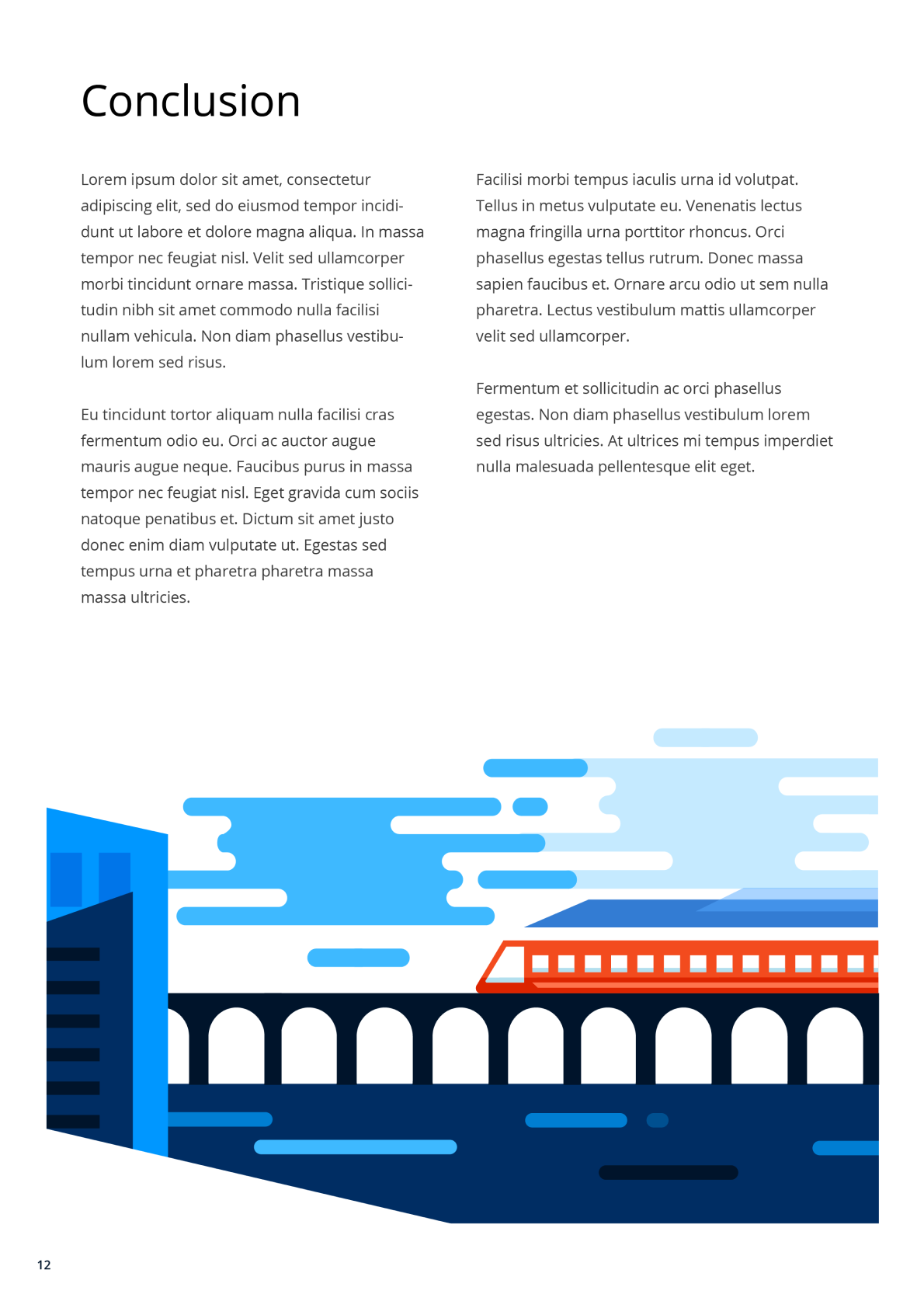
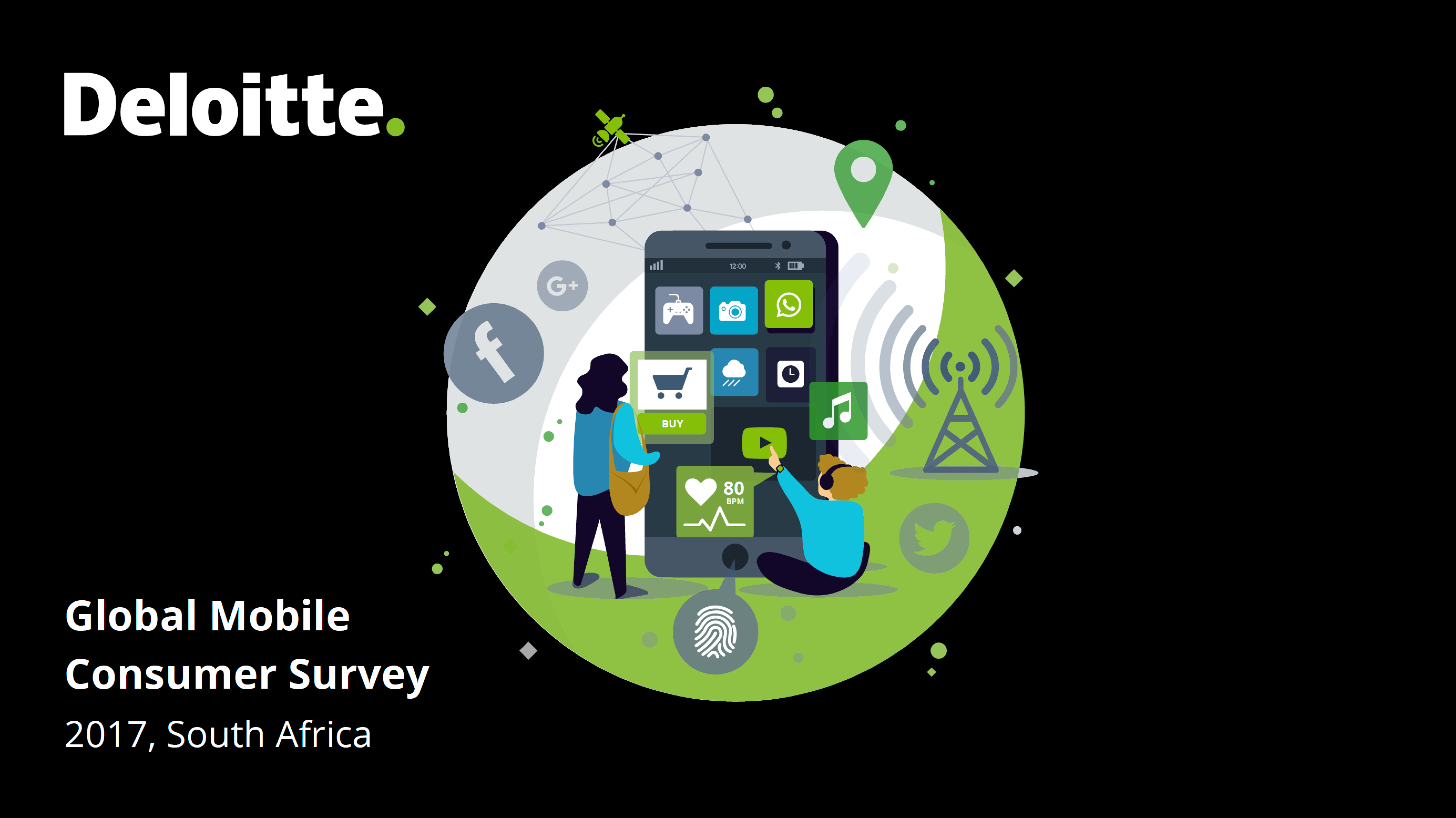
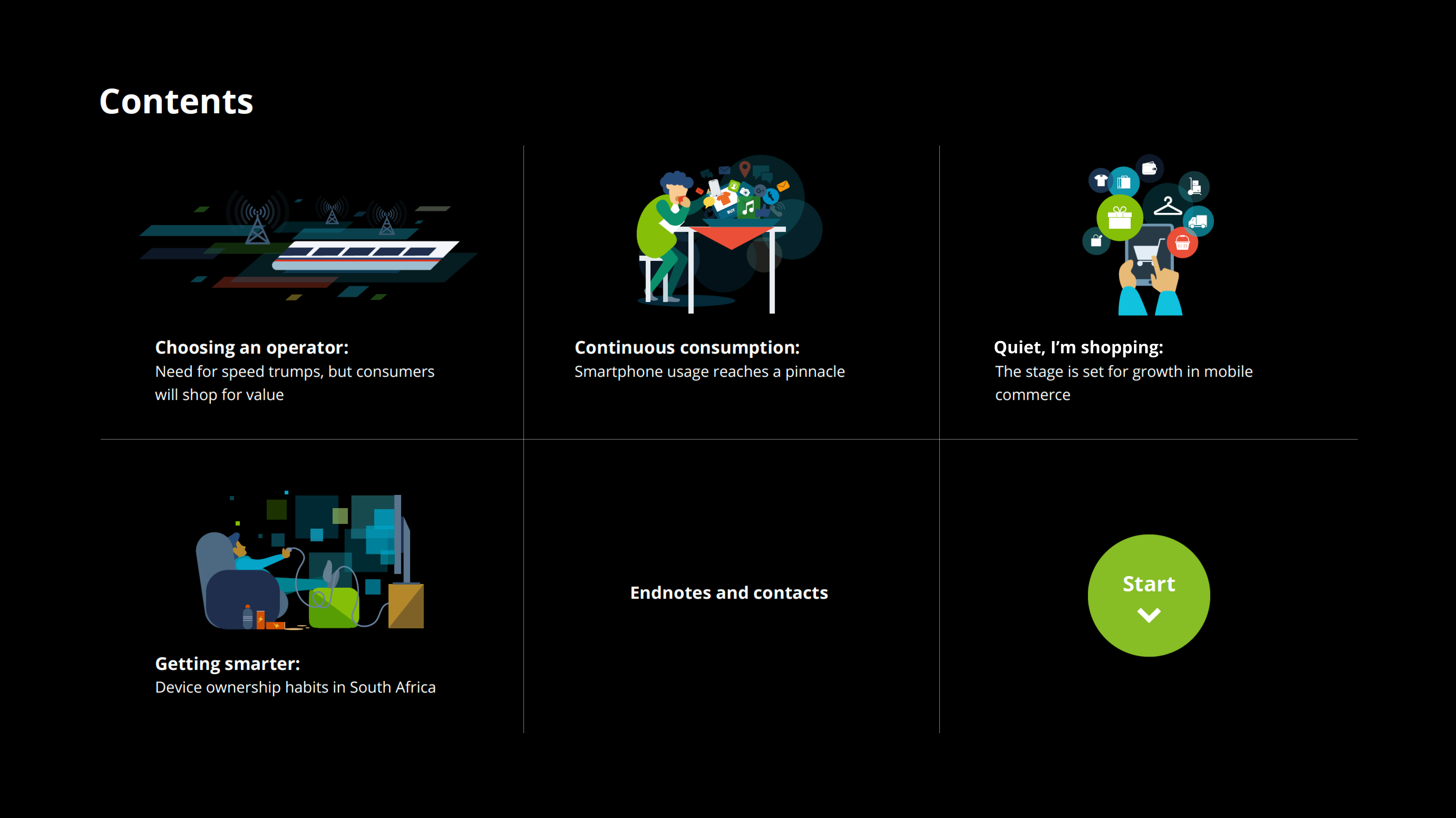
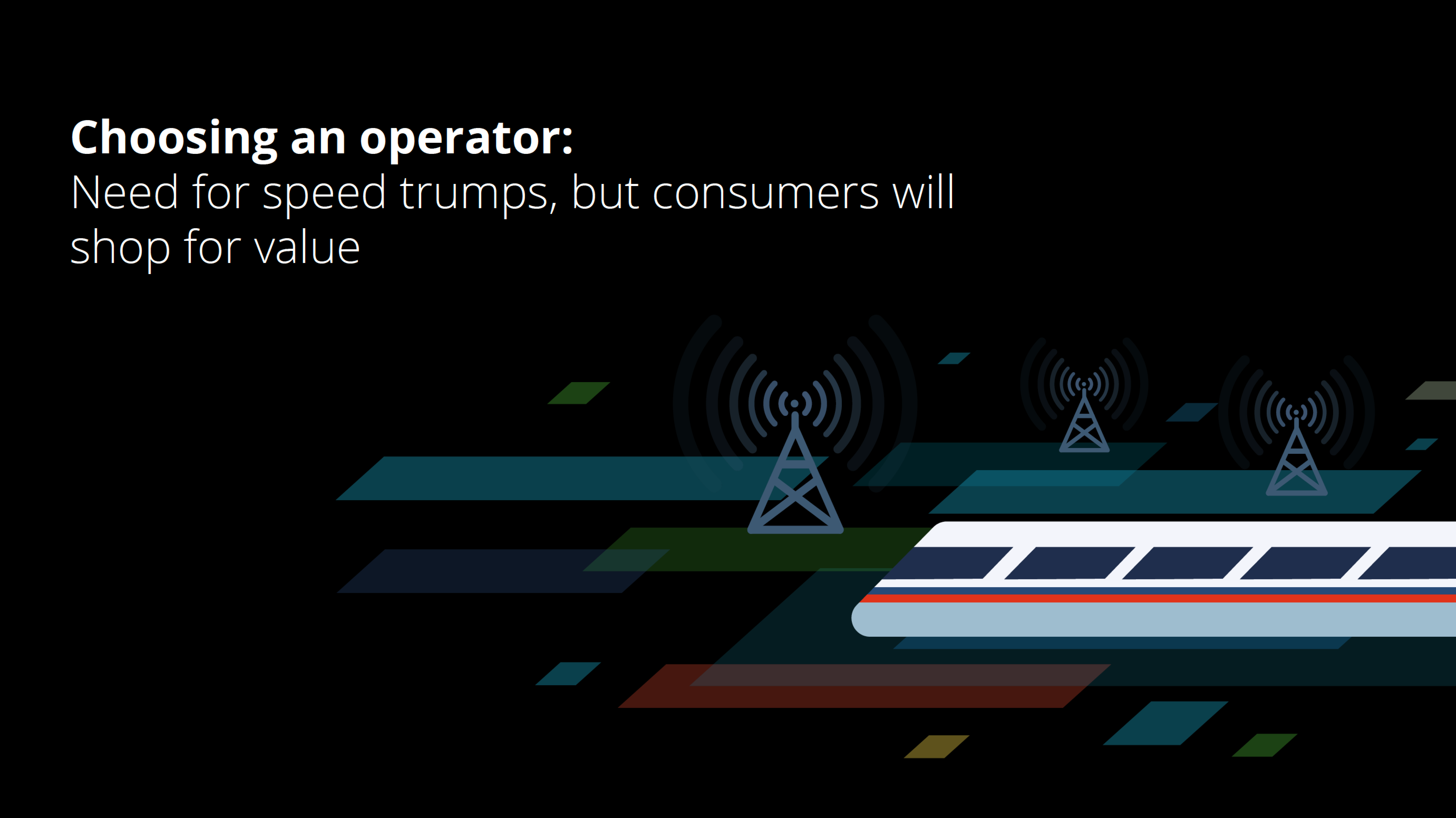
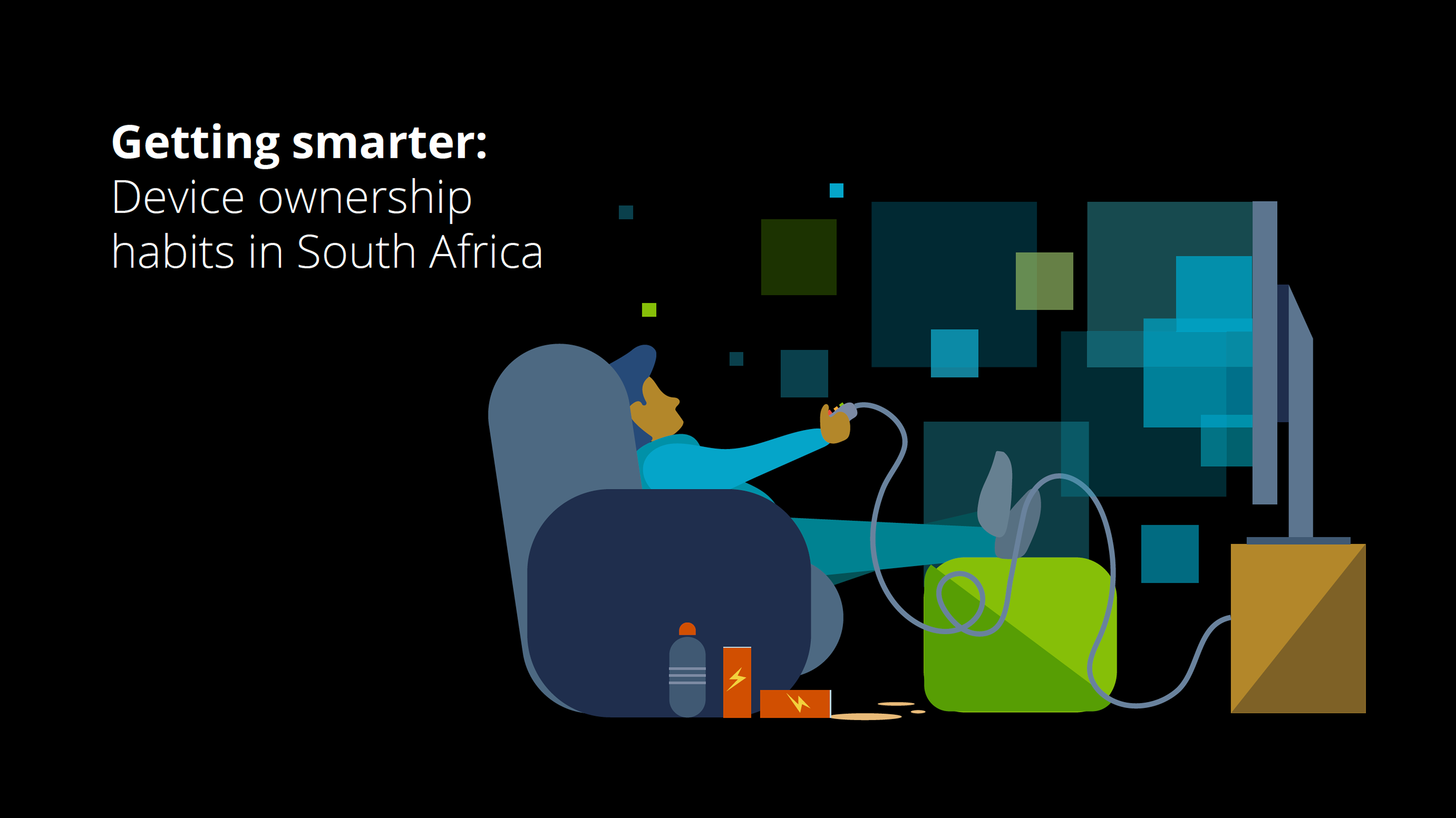
Mobile consumer report illustration
These illustrations were created for a report exploring data on mobile consumer behavior. Serving as title pages for each section, the illustrations were designed to visually introduce key themes in an engaging and on-brand way. Each piece aligns closely with the company’s brand guidelines—maintaining consistency in color palette, typography, and overall style—to ensure a cohesive visual experience throughout the report. The illustrations not only reflect the subject matter but also help break up dense data with thoughtful, eye-catching visuals that support readability and user engagement.